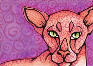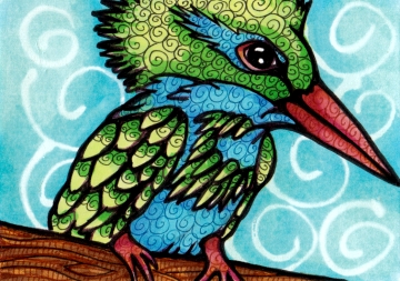
Purple Peach Peterbald Cat ATC, 2.5″ x 3.5″, Copics on Bristol
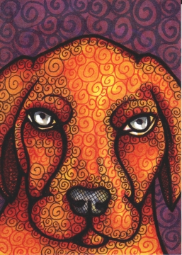
I finally decided I should document these tiny arts just like any other. Or, some of them at any rate. So here you have the latest three (I am most pleased with the Cat), with a slideshow for one of them. It’s funny to see them in a blog post. I’ve saved them at 5 inches and on my screen they are the exact size of the original. Still trying to decide whether to list them for trade or for sale in my Etsy shop.
Barclay the dog got a bit overworked, and the lighter background was probably a better choice. I thought about leaving him out but this blog was not intended as a best-of production. (For one thing, way fewer posts!) Both the cat and dog could use whiskers and I just got a new Uni-ball Signo white gel pen, which came out on top after rigorous testing at ArtTrader magazine. I skipped the whiskers for now but I did use it on their eyes to good effect.


You have growth as an artist in your works and how you present your work and blogs. Love the slide show of progress that is a huge insight into your process. Love your stories too.
Oh I love these!!!
Cindy, I kinda like the dark behind Barkclay, the eyes really do take over, to good effect. I also really enjoy the limited color family in each card.
Overall, beautiful!
I agree with Elena, I really like Barkclay – the rich tones and eyes especially. I don’t think he looks necessarily overworked.
Your style reminds me of silk batik fabrics in a way.
Mm, the cat’s my fave too (but then I love everything cat, so …;), but the transparency and light in all your work is amazing. Very nice.
Wow! These are wonderful! I’m so glad you shared them here in all their glory..and the slideshow is terrific. Hmmm..I think they all are super, but Barclay is actually my favorite. I don’t think he’s overdone at all! Lovely color palettes too. Thank you SO SO very much for your kind words about my double-decker crazy bus..I had a ball with it and I’m so happy you enjoyed all the characters! : )
I have to agree– I like Barkclay just the way he is– the colors and textures are really rich and don’t seem overworked to me at all. I love the texture in all of the new pieces– just great!
I like the kingfisher best. The colors and patterns are so happy. I also like the Barclay’s expression, I can only wonder what he might be thinking :)
Hi! Love all but do love the Kingfisher best if I have to make a choice!! Love you!
Don’t be mean to Barclay – I love him! His vivid eyes are stiking. I agree that the darker background was a good choice. These are all winners!