
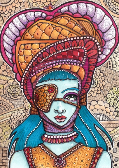
Brigid the Acolyte
5″ x 7″ Copics, fine liners, gel pen
I’ve been getting up to something larger than 2.5″ x 3.5″ (ATC size) lately. With this I couldn’t decide what to do with the background so I doodled. It’s a bit sparse but I didn’t want it to compete with the figure. Submitted for the topic “Mask” at Illustration Friday.
ALSO! I have ordered test prints of a Dogs poster (finally) and one with animals in fancy clothes.
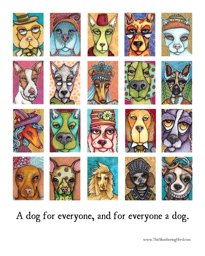
Art Card Dogs poster, Version I.
16″ x 20″ and including twenty individual art card dogs
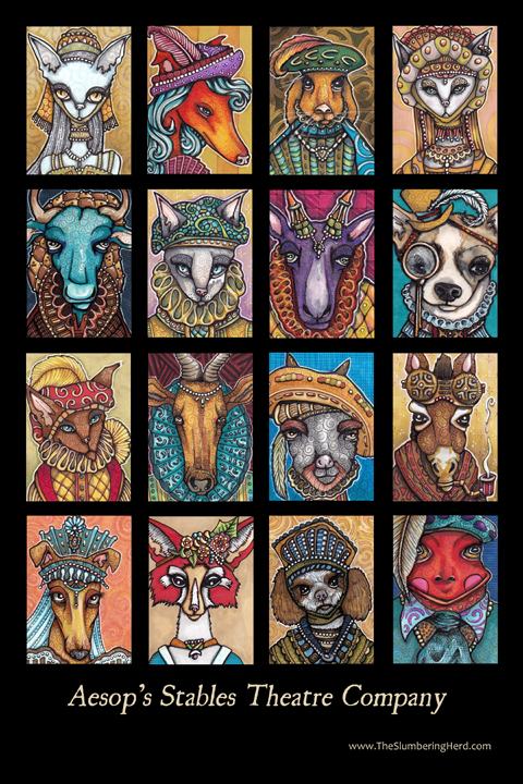
Fancy Clothes Animals Poster Version I
Aesop’s Stables Theatre Company, 12″ x 18″
People seem to prefer the black background but I may do both. All opinions welcome! Sorry for so much stuff in one post!
[portfolio_slideshow size=”large”]
Love this! You are the queen of texture.
Cindy, that is a cool illustration. I love the intense colors contrasted by the almost black and white muted background. Great eye patch, as well.
Layer upon layer of eye entrancing pattern! Love that blue maiden! BTW, I go for the black back round for the dogs:)
Beautiful eye patch and great collection of dogs and theatrical figures! A poster of all the little images together is a great idea! The multitude of ideas, clors, shapes, expressions is a feast to look at!
These posters are going to be selling like crazy. They look so great. And the blue maiden has it all- love the background.
Looks very aristocratic. Nice background!
Its so interesting to see the evolution of your style. The swirls and patterns are amazing…..I’m so in love w your work…….where can I get a signed copy of the poster?? I really think these would look fantastic on a set of playing cards……..
I like all of the blue maiden’s textures. She looks quite exotic.
I think I prefer the darker dog poster background, but maybe that is because the lighter background gets lost on your white blog page. Something to think about.
Welll, I hate to confuse things for your with my 2cents worth… but I like the white background on the dogs as is:-) I think the white picks up and echoes the light in their eyes, spectacles, noses etc… maybe it is just that I am so very protective of white and light as it is so crucial in watercolor – and a constant battle to keep in order for the picture to have life! So keep in mind my vote comes with baggage:-) Watercolor paranoia baggage;-)
She is gorgeous! I love how you put texture in the paintings with lines and doodles. :) I prefer the black background, too. But they both look fantastic!
HI Cindy, I love the doodles in the background of Brigid. I LOVE the posters. Both colors are striking but I actually prefer the white one…I’m always the oddball! I just think for mounting on a wall the white is easier. I can see my daughter loving it on her wall, but if I’m honest, I would only put it on the wall if it was white…just my two cents. :)
I especially like the dogs. But then I love dogs :) It’s beautiful to see collections of your pieces.
Well, you have been busy! Great color and and lovely little textures in the Aesop’s fables collection. I really enjoy seeing all of them together!