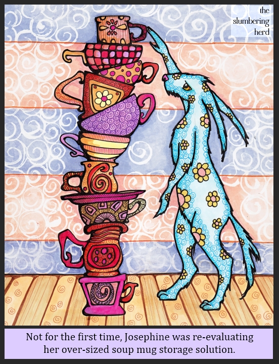
So I recently launched an art challenge with the prompt “Catastrope” at the Etsy group Doodlers Doing Doodles. [I did not start this group (too wordy for one thing!) but as the only leader I became de facto Captain when the real one took off for destinations unknown some six months ago. If you want to join, just drop me a line!] Anyway, my idea was either a stack of dishes or a stack of monsters… or possibly a stack of dishes AND monsters. So I started a stack of coffee mugs and tea cups, and then the Illustration Friday topic “Fluid” was announced.
I believe I am stretching this topic further than I’ve personally stretched an Illustration Friday topic, to include what turned into a mountain of soup mugs. (Originally tea cups and coffee mugs but really, Josephine could hardly drink tea out of these monsters.) (Hey! It turns out I did do a stack of dishes and monsters.)
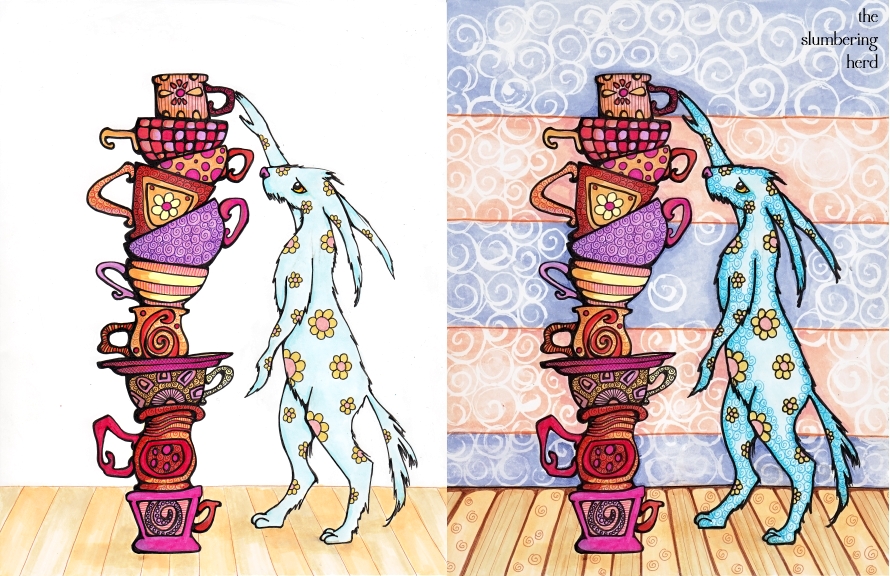
This will be my third outing with liquid frisket (the results of which are those white swirls in the wallpaper). The paper I’ve been using is Bee Paper Company’s Artist Marker Pad, recommended for use with Copic markers. It is insanely smooth and very nice for markers, but it’s only 110 lb. so the frisket buckles it a bit. That is part of the reason these particular swirls are much larger than my normal. Here’s how it all began:
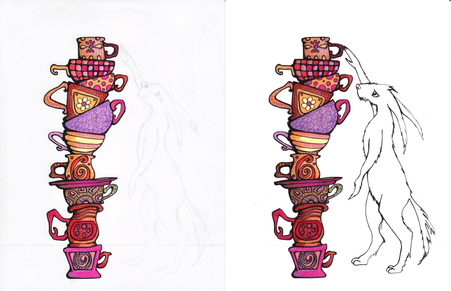
I figured some sort of creature imminently at risk of toppling the stack was necessary for a looming sense of “catastrophe”. I also used color before black multiliner to cut down on smudging.
I thought about leaving it here, with just the outline of the rabbit beast. Many Illustration Friday folks employ two different techniques in one drawing or painting and it is usually a pretty neat effect. Perhaps I should have done a background but left the bunny as she is here. Actually, if I did it over again that’s what I would do.
I think the background is too busy. Or I just don’t know how to make the foreground pop out. I suppose I could put an otherworldy glow around the objects but will have to look into additional methods. (Do you have one? Please let me know. Yet another item I would have learned in art school. Alas!) Oh! And one more fyi, because it seems like good info: the font in the final at the top is Cambria Math.
Thanks so much for stopping by!


Nice work, made me laugh also as i have a cupboard full of cups stacked this way : ]
Wow this is awesome!! wonderful coloring and details.
It’s lovely! Really good, I like how you show all the process :)
Yet another great piece from you! I always love looking at what you’ve done and I like how you explain your process. Also, I have found that you can stretch almost any illustration to fit IF.
I think it’s great, a sense of danger there too!
Wow, thank you for the insight into your use of liquid frisket! I’ve never been successful with the stuff, but you’ve inspired me to give it another go, although I will never be able to use it in the brilliant way you do. Terrific illo.
oh I love all the patterns. And it’s really fun (and informative!) to see your process. Wonderful!
I think it looks amazing and the rabbit and cups do stand out because the background is a more muted colour. I love the way you explained how you did it. I have frisket for watercolour but I’d never thought of using it with copics. I love the effect!
I love your mugs! Or rather Josephine’s. Great idea!
Thank you to all! I’m glad the frisket effect is getting a nice response. I do like it, although I need to get a wooden stick or other implement because the frisket keeps ruining (very cheap) brushes due to drying so quickly on the bristles and being evilly difficult to remove!
Love this illustration!It’s really beautiful and it made me smile. I particularly like the way you have showed the process – so interesting.
great work of Josephine that she is able to go this high with the mugs!
The patterns and colors are simply awesome! As an etegami artist, I’m partial to blank backgrounds and would have left out both wall and floor. Is that shocking?
Only a little shocking! Seriously though, I did think about stopping there. But I had a plan for the wallpaper so I just kept going. I may try stopping sooner more often because I think some of my stuff tends to feel overdone.
Lovely illustration! I loved the stack of mugs! It felt very reminiscent of Alice in Wonderland to me.
Lovely collection of mugs
This is an amazing piece of art, the idea, the colors, the patterns. I just love those mugs. Wonderful.
Have a great new week.
Awesome work! Love the time that went into this one!
This is really wonderful, Cindy. I love all those beautiful cups!!!
(I didn’t have any formal art training, so I can’t help with any tips or tricks.)
I love it! Your attention to detail is mesmerizing. Great work!
Another lovely piece! I think I might have have left out the background completely – less is more sort of thing! I gave up using brushes for masking fluid – have you tried using a ruling pen? It’s a favourite tool of mine!
Liquid frisket with copic markers? interesting effect, I’ve never tried it but I like the look. The varied black lines help the design come out nicely. Thanks for your comments on my illo!
Thank you! But you didn’t leave your site address so I don’t know who you are! (I’m never sure if people do that by mistake or on purpose.)
As always, great vivid colors in your illustration. I like the texture on the precariously stacked cups.
Great work Cindy.
Thanks for leaving all your positive comments.
Great work, Cindy.
Thanks for leaving all your positive comments.
Another wonderful illustration! Love the colors and patterns, very fun.
Very nice illustration! I love the colors and patterning you used on the rabbit. Thanks for walking us through your process, it’s so interesting to see all the steps you took.
Fantastic!! love the scene!!
Wow, such a colorful, fun illustration! Love your style!
Thanks for your visit on my blog :)
Cheers,
Junko
I love your work and wondered how big your marker set is??? Thanks!
Thank you to everyone for the nice comments! As to how many markers, eek! I should probably count again. Last time I checked I was at about 80, a mixture of the three sizes but mostly sketch, and about 10 refills (mainly very light colors which I blend with). I will try to remember to post a pic of my desk next time. :)
I personally don’t find the background too busy (being a lover of pattern!) but to unbusy it, make the contast between the white spirals and the blue and pink background closer in tone to eachother so that they ‘sit back’. It’s a lovely painting, I’d love to have soup bowls like any one of those!
Jess xx
LOVE your unique style! The bright colors & bold lines along with different patterns are a feast for the eyes! And I enjoy seeing the work in progress. I haven’t used liquid frisket in close to 20 years, but this piece makes me want to revisit it! Well done!
I really like your illustrations…wonderful mix of pattern and form. Beautiful!
Aww this is so sweet! There’s so much detail in your illustration, so many gorgeous patterns as well :)
Your mugs are all excellent. I like your outline and subtle shadow work on the mugs.
Thank you also for sharing your process!
I absolutely love the colors and the detail of the patterns on the mugs. Honestly I could see them being in my own cabinet. Wonderful job, I love seeing your process.
It so nice to see the whole process–I love your use of pattern!
WOW WOW WOW, I LOVE this! Well, first of all, I love teacups. Soupmugs, teacups, same thing. I WILL drink tea from a giant soupmug. :D The colors and patterns are fantastic. I wish I could really buy all your mugs. I love Josephine’s shape and the look of concentration in her eye. Fantastic!!!!
I love your patterns and colours. Very original concept too. Let’s hope there’s not too much fluid in those cups!
Again, this is such a great work of art! I don’t think he background is too much. As you outlined the rabbit and the cups, it stands out. Plus there’s more details and heavier colors. But you could try to do some highlighting with white acrylic paint… If you dilute it a bit with water you can add a thin layer, upon layer…
And hey, where and how can I join that etsy group? Sounds like fun!
I like your work and patterns. Nice to see how you make your illustration!
Haha.. the subject of this one cracked me up – I especially love the coffee mugs! A couple tips about making the foreground stand out more – cut down the contrast of the background (basically, the white in the background wants to jump out). Cutting any white out of your background, will immediately make any white in the foreground pop out further. Also, because you have a stack of cups, the horizontal lines in the background often intercept where the cups are and are a little distracting – your eye tends to follow strong horizontal lines off the page.
All-in-all, I’m really loving your work, but with a B.A. from art school, I just thought I’d share a few tips since you were asking! I hope that’s helpful – you sure have a ton of comments on this one, so maybe someone already gave you similar feedback. I really want to own some of the coffee mugs in that stack!
That’s perfect! Just the kind of tips I really appreciate, so thank you! I have this feeling people are very hesitant about offering critical feedback because art is such a personal thing. But I think sharing tips is one of the best tools we have to improve.
(So if you’re an arty stranger reading this and your tendency is to be defensive, just take a little step back and try to imagine a critical comment is about someone else’s work.) ;)
I think it looks screamingly cool! The mug and rabbit colors are rich and vibrant, enough to make them stand out against the background. The only things you might try might be to use more contrast color in the back…maybe light aqua or teal instead of the orange? Or give it a “depth of field” effect by blurring the background…not sure how, maybe doing it first and using water to bleed the harder lines a bit and soften up the spirals?
Try using Q-Tips as frisket applicators to save your brushes…they have a precision tip version now that comes to a point.
Honestly and truly I love it the way it is! Many thanks for the step-by-step details…cheers!
What I really like about this one are all the stories that can be told to little ones while looking at it. I can see a story come alive about the “Great Blue Hare”. I can.
I have a student in my composition class who is working with copic markers and I am fascinated when I watch him work. Oh for more time and money! I’d love to try it.
You have such a wonderfully unique style. I love the extra details and patterns you insert in every piece of drawing you do.
Thank you for the comment on my blog too. It made me laugh. Dan’s doing his masters on those weird worms, so I have to listen to him go on and on about it sometimes. Fun times!
I know you posted this some time ago, but I am loving reading your blog.
To drop your background back make it much lighter! Absolutely love seeing your process!