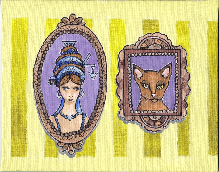
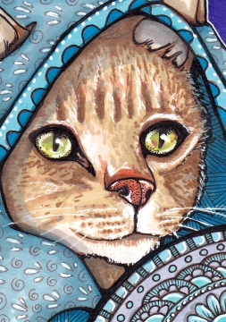
I was going to say “Cat Hat” instead of “Animal Hat”, but I suspect it looks more like a bear hat, or possibly a brown wolf hat? I shall call it a cat-bear-wolf hat.
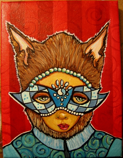
Animal Hat Masquerade
6″ x 8″ Acrylics canvas on 3/4″ frame
Submitted for the topic “Disguise” at Illustration Friday. And it is Day 26 of the 30 Day Painting Challenge!
You will see in the progression photos (still quite amateur quality photography), I changed colors quite a few times. Maybe I should have stuck to blues and the first, lighter blue background. I’m also not totally sold on that bulky blue-green tunic. But I must stop here and move on!
Thanks for stopping in!
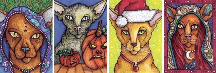
[portfolio_slideshow size=”large”]