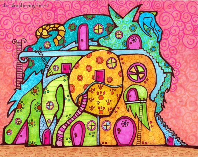
Serious colors, right? Copic markers. I have asked if they have any positions open. I mean, more than one person has suggested I sell their products on my site! I tell you something, it’s pretty cool to be a fan of a brand that is cool and makes a cool thing. Because there are so many brands that are not cool and make absolute crap (and ruin the planet and ruin people). Ugh, don’t get me started. On to the progress pics!
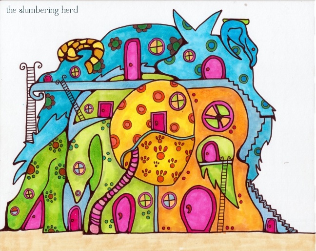
So for the latest Doodlers Doing Doodles challenge, we used my prompt suggestion “Fantasy Cityscape or Skyline.” I really love cool brightly colored art with lots of whimsical buildings, whether a small town or big city. And I would like to be able to do scenery like that. However, usually I do animals. Well, I still did animals. But also buildings!
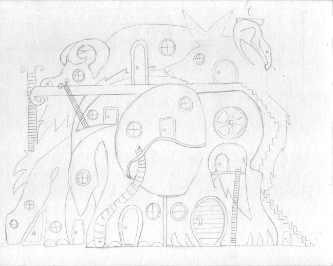
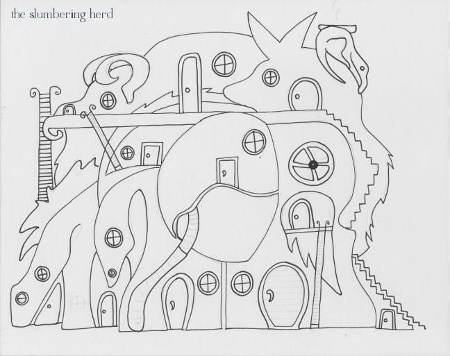
As you can see I originally had a bit of smoke coming out of the chimney. I wish I’d left that, because I’m not sure it’s clear that it’s a chimney. Though this post is called Beast Town Hotel, it was originally supposed to be a town (a townscape).
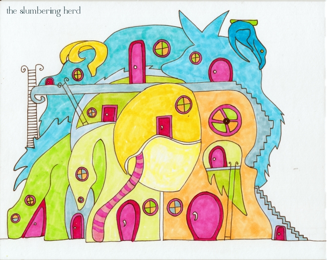
Here is just one coat of one color for each item. I was originally going to stick to blues and greens. And then added yellow. Then I thought the doors should be bright pink – and I really like how pink and orange look together. Well. You can see the green/blue plan was somewhat overrun.
I included this one to show the kind of very rough shading I use as a base for whatever details will come on top. I realized through trial and error that this is how to get those lovely glowy spots. (You painter people probably know this, but we all come to wisdom in our own good time [one hopes]!)
For the larger patterns before the swirls I wanted a variety, but nothing that would overwhelm the doors.
I’m pretty happy with this (particularly the colors), but I am running into limitations with my biggest regular nib pen, the 0.8. I should probably use a brush with ink for thick outlines (that I prefer not to be a uniform width), but that would require learning another new thing. One of these days, perhaps!
I would offer a free night at the Beast Town Hotel, but they are booked way into 2026. And actually, only a few rooms are hotel rooms. Several doors lead to spacious apartments with permanent residents. However, you are always welcome to visit and have a meal at the restaurant. It’s difficult to describe the food in humans terms, but it is most like the noodle cuisines of Thailand and Vietnam. If you do happen to stop by, you will be charmed by the variety of cute and funny beasts that frequent the bar and indoor swimming facilities.
Thank you so much for dropping in!


Really cute, I like pink and orange as well, also yellow.
What a symphony of delicious gelato colours. I just want to eat it! I also loved your stripey bustle. Now bearing in mind the psychedelic splendour of your work, and your rapid-fire creativity, it’s my turn to be rude and ask you: Cindy, what are you ON??
Thanks, Lilah! Gay, I can’t even say I’m high on Copic marker fumes, as they don’t seem to have fumes. (They also don’t smell like fruits and gumdrops, but I suppose we can’t have everything). The colors come out of the markers this way (with a little prodding and also secret blending techniques). (Ok, I just made that up about the secret blending techniques.)
hello cindy, i really like your illustration style and the bright colors you used. so creative :) and cheerful!
Love the work in progress! Your work is singing with colour – those markers are so vibrant!
Your work is quite simply FABULOUS! Thanks so much for sharing it with us…
Warm regards,
Beth
This is great! Reminds me of the witch’s cottage in “Hansel and Gretel”, except it’s made of beasts instead of candy.
And now that you mention it, I would love to read a blog post of yours where you do a “sales pitch” on these copic markers!
Hi. Loved your work. Thanks for the visit!
Ana.
i love the colours and fantastic creatures! am amazed at how you can do this with copic markers.. i have a range of grey ones but have never managed to blend them as seamlessly as you do here!
Well I started about 5 months ago, and have used them exclusively since then. At first I didn’t do much blending at all. Then I would get muddy colors a lot. But you just gotta keep plugging along, and improvement happens. :)
I know just which room I’d reserve!
Your work always leaves me fascinated. Thanks for explaining how you do it. This is great!
wow.. the colors are incredible!!! they look like gelato ice-cream.. beautiful detail and shading too!!