
Submitted to Illustration Friday for the topic “Silence” because silence is one of a scouting team’s most potent weapons!
Scouting Team, 6″ x 6″ pen and ink with Copic markers
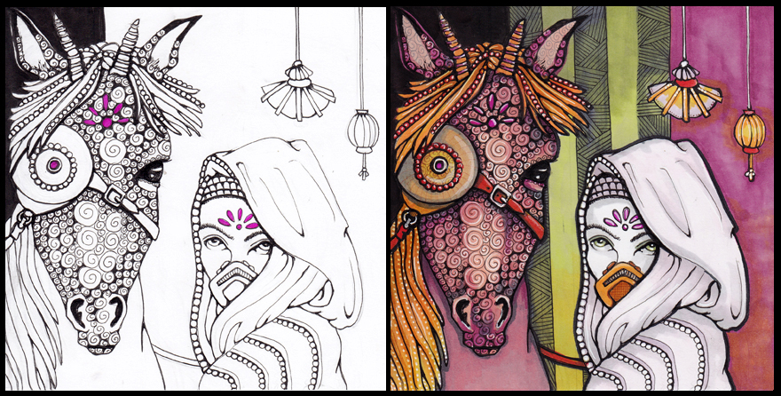
Inked version for Inktober and final color version
I must say this was an interesting exercise! For Inktober, I attempted a black and white image but you can see on the left where I got stuck and started to add color. I was going to fill the whole background with black, but I decided I should at least TRY an interesting background of some kind. And hopefully keep it from clashing or interrupting the figures in the foreground.
The final version seems a bit overly busy, but I don’t think it is competing with the figures, so that is one victory! I don’t tend to plan ahead, so maybe that’s something to work on. Here is one of the horse photos I used for reference.
I’ve also noticed that this orange-green-purple (red-violet, really) palette has followed me through three projects! Here they are all together. This is a departure from my usual VERY bright colors. Who knows what colors I shall use today! Maybe it will be ones that do not need to be filled. Haha.
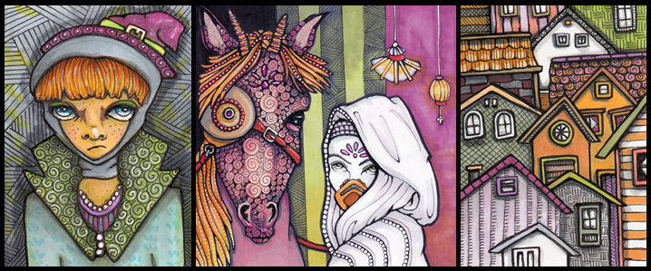
Annabelle, Scouting Team and Stacked Housing
pen and ink with Copic markers
This is horse number 15 of the Season of the Horse project, in which I draw horses in hopes of improving that skill. Thanks so much for stopping in!
beautiful… as usual!
Hi! Good to be here again and look around on your blog. I love your colors! And your style has changed a bit too. Its more refined, with thinner lines. I don’t know exactly but I like it!
Beautiful horse and blending!
I love watching the progression of this painting. I too have grown fond of the wine, rust and orange colors. Guess its the fall influence.
Cindy, the witch is great. I like her expression. The more muted colors give this work a very different feel. I love the contrast of the gray lady and the colorful background. Nice work.
I love all three! But then I usually love EVERYTHING you make! <3
I don’t think it is too busy. I like your color combination. I find red, green, and ocher follow me around.
Maybe you should stick with this color combo for the entire challenge. Would make for an interesting poster later on….
I don’t think it’s over busy at all. I think it’s gorgeous! One of my favorites, in fact!
I like all the detail in this, Cindy. Good job!