Category Archives: Copic Markers

Micro Cityscapes in Pen & Ink

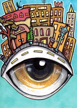
Eyeline
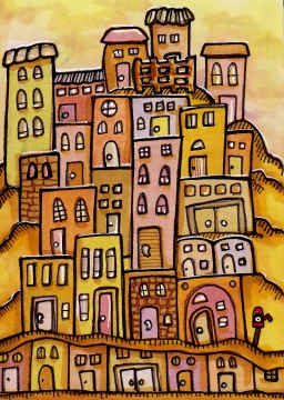
2.5″ x 3.5″ Copics, fine liners, gel pen

I like this one because I remembered to add the little streetlamp, and potted plants, and a tree, and of course the garbage can. Which may not be a garbage can at all. Perhaps it’s a portal connecting all the garbage cans in all the micro cities.

With that in mind, I shall submit this post for the Illustration Friday topic “Hidden”, for the hidden garbage can portals. Which I didn’t even know about until I wrote this post!

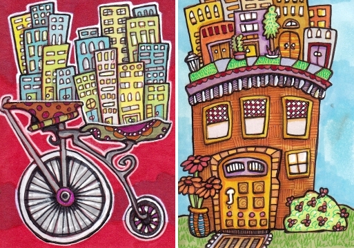
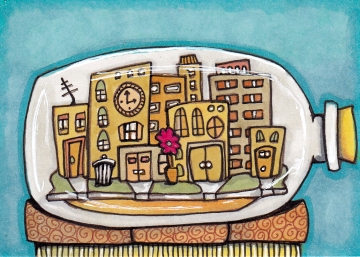
Bottled City
2.5″ x 3.5″ Copics, fine liners, gel pen

See, there’s another one! These are cities number 19 and 20, of my 100 Cityscapes Project. One or both may end up in my shop.

Thanks for stopping by!

[portfolio_slideshow size=”large”]


Lush Red Maiden and a Calavera Quartet

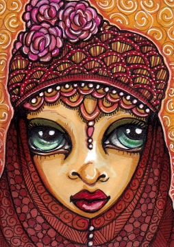
Scarlet Order Seer
2.5″ x 3.5″ Copics, fine liners, white gel pen

Probably my favorite maiden so far, and submitted for the topic “Lush” at Illustration Friday. (Lush color and detail!) Made for a trade, I was a little sad to let her go.

Over the long weekend I was in Muskegon, MI and brought some ATC supplies. I was surprised to find my (sort of) brother-in-law with a brand new and rather keen interest in Day of the Dead art and folk figurines. So I did a bunch of sugar skull type cards. No scanner though, so no progress pics of these!

Calavera Quartet
Each 2.5″ x 3.5″ Copics, Microns, white gel pen

The top right is Sad Leona, and the bottom left is Bony Madeleine. The one with the horns may need a little more work. They are fun to do! Thanks for stopping by!

[portfolio_slideshow size=”large”]

Silver Cat and a Cat Card Retrospective

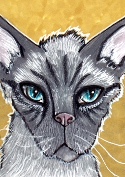
Hector Cat ATC, 2.5″ x 3.5″ Copics, Microns

A silver cat for the topic “rescue” at Illustration Friday. Hector came into the shelter with his brother Hans, two spitting fur balls about four pounds each. A kind and patient foster couple took them in and eventually adopted them both. Apparently Hans became a lap cat but Hector likes to sit on the back of the couch and lick your head.

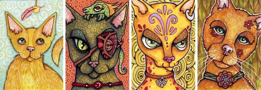
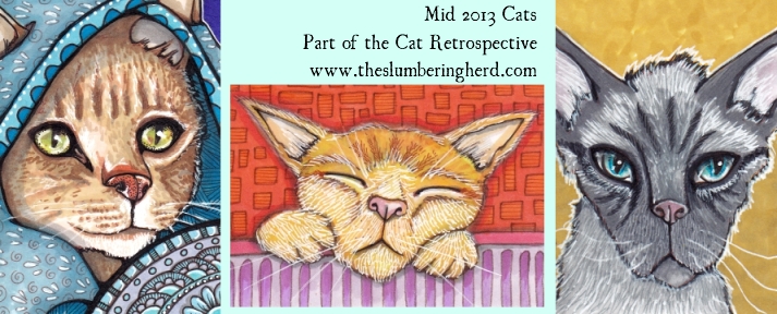
And then I thought, these cats I’ve been doing are different than cats I have done in the past. Perhaps it’s time for a cat retrospective!

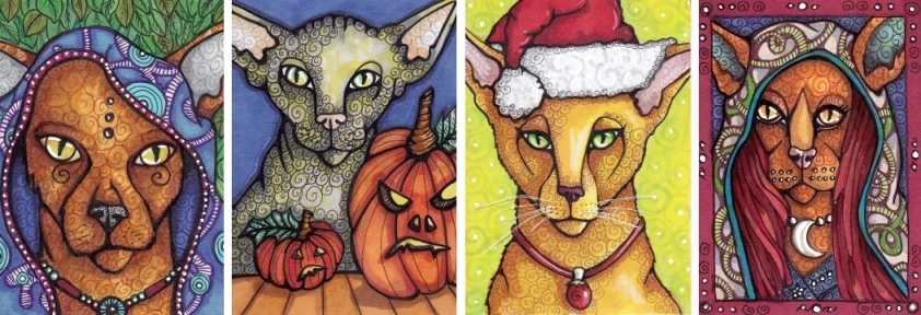
Four Early Cat ATCS,  each 2.5″ x 3.5″, Copics, Microns

Of these, though I dig the cloaks and Santa hat, my favorite is the pumpkin cat. Maybe because she looks the most like the Peterbald type cat I often use as a reference.

Four Early Middle Period Cats, each 2.5″ x 3.5″ Copics, Microns

Of these my favorite is the first one, because it’s a different style cat that really worked – though I haven’t been able to duplicate that style in quite the same way since.

Three Current Cats!

Of these I am particularly fond of Sleeping Mathilda, in the middle. I think she’s pretty cute!

Do you have a favorite? I love cats but I’m a dog person at heart so I am always interested to get a cat person opinion. (And all the other opinions, too!) Thanks for visiting!

[portfolio_slideshow size=”large”]


Maiden Cityscape Mash-up, in Markers

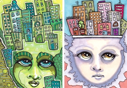
Her City Hair, and Village of the Mind
Each 2.5″ x 3.5″ Copics, fine liners, white gel pen

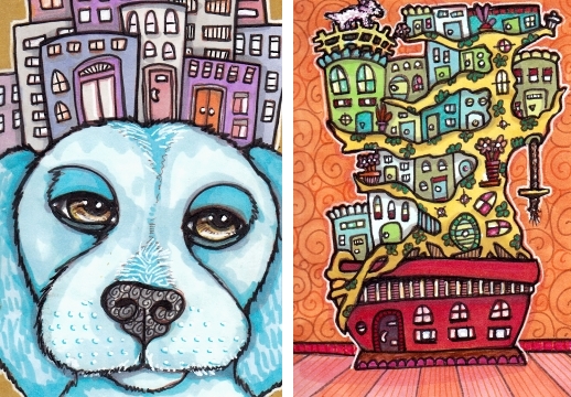
These started with an intuitive face (see last post!), and ended with a cityscape. I suspect the continued blending of subjects shall occur for some time! In addition, here is the threatened dog plus cityscape, and a bonsai community.

Blue Dog City, and Bonsai Town
Each 2.5″ x 3.5″ art cards, Copic markers

Have you done any goofy mash-ups lately?

[portfolio_slideshow size=”large”]

Psychedelic Faces with Copic Markers

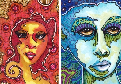
Rhonda Red and Donna Disco
Each 2.5″ x 3.5″, Copics, fine liners, gel pen on smooth Bristol

Recently someone pointed out this neat exercise with intuitive faces. Although the directions are for watercolor, I figured I could try to coax a more watercolorish effect with Copic markers. So far the results have something of a hippy vibe.

For this reason I am declaring this the Power of the 1970s post, for the topic “power” at Illustration Friday. I have not abandoned the cityscapes, more of which you will undoubtedly see if you come around next time. And thank you so much to Vinyl Eraser who does terrific architectural drawings, for mentioning my 100 Cityscapes Project!


Thanks for visiting!

[portfolio_slideshow size=”large”]
Curiouser Cityscapes, in Pen and Ink

Penny Farthington and Roof City
Each 2.5″ x 3.5″ Copics, fine liners, gel pen

As it’s my fresh obsession, this cityscapes business, I am submitting several curious cities for the topic “Fresh” at Illustration Friday. And I am pleased to say the slideshows are working again! And a few other things have changed around here… but not too terribly much. My 100 Cityscapes Project is up to 14, with several more in the works!

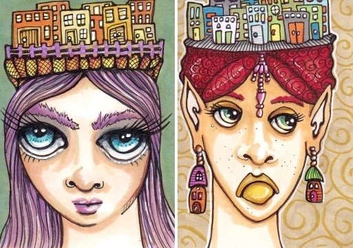
City Chapeau and Lucinda’s City Hat
Each 2.5″ x 3.5″, Copics, fine liners, white gel pen

Here we have two maidens modeling odd but stylish cityscape fashions. You can expect a dog with a city hat next, and perhaps a robot, as my ATC* cityscape mash-up experiments continue! (Some of these cards and many more original art cards in my shop.)

Thanks for stopping by! Questions and comments welcome.

[portfolio_slideshow size=”large”]

*ATC: Artist Trading Card, standard size 2.5″ x 3.5″ and often traded, sold & otherwise collected.

Colorful Cityscape Art Cards, Pen and Ink

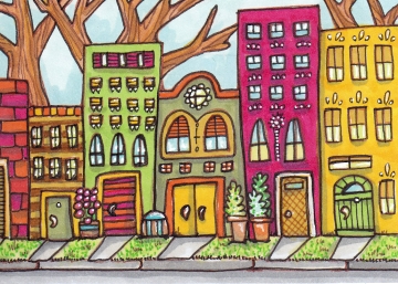
Darling Avenue
2.5″ x 3.5″ Copics, fine liners, gel pen on Bristol Board

More colorful cityscapes (with cute names). So glad I started doing these tiny towns and streets because they are super fun and I recommend you do some. You might not like your first one, but try again!

I expect I will do many more, maybe even some large ones. Hmmm. 100 Cityscapes Project? I will have to think about that.

Village at Blushing Hill
2.5″ x 3.5″ Copics, fine liners, gel pen

The colors of this one remind me of a dreamy desert landscape. I settled on a name for the color that the peachy sunset casts across the village. Thanks for stopping by!

[portfolio_slideshow size=”large”]
The Village of Little Sprout, for Jungle at IF

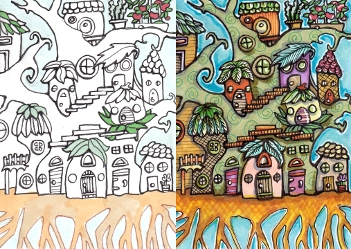
The Village of Little Sprout, process and final
2.5″ x 3.5″, Copics, fine liners, gel pen on Bristol Board

Submitted for the topic “Jungle” at Illustration Friday. My latest unconventional cityscape, it was very fun to make. And I would like to live there. :)

I was also quite pleased with this cat, though she has only the most distant connection to the jungle, having moved to the Great Red Plains in her youth.

Tarabell the Theurgist
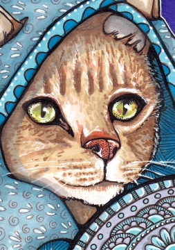
2.5″ x 3.5″, Copics, fine liners, gel pen

Shown here with her ceremonial robe and shield, Tarabell was one of the three founding members of the Lunar Cat Council. A cat called Elsbeth wears Tarabell’s robe now, with great care and reverence.

The Lunar Ceremony is open to visitors twice per year, and it is a grand and wondrous honor to see the entire Council in their ancient finery.

(Somewhat more realistic than previous cats!) Made for a trade at illustratedatcs.com.

Thanks for visiting! I forgot to send out my last post, so maybe take a look if a robot called Croissant sounds interesting to you.

[portfolio_slideshow size=”large”]
Sizing Him Up, Copic Art Card

Sizing Him Up
2.5″ x 3.5″, pen and ink, Copics

Croissant is the sort of name one acquires when one’s owner allows his six-year old to name his robot butler. Croissant bore it stoically, after the fashion of his kind. But perhaps it made him slightly more suspicious of visitors to the family estate. Other robots, in particular, were forced to endure quite stringent scrutiny.

For the topic “Robot” at Illustration Friday. It’s a bit abstract! And I’m not sure how the big fellow ended up with a lizardy texture. Experimenting, I suppose!

I also figured out a way to get that white on toned paper look, which is to use white gel pen in a sketchy style over lightly colored areas. In this case, lightly colored with warm gray 02 or 03. I also tried to cover up the design in the large eye with gel pen. To mixed results.

Thanks for stopping in!

[portfolio_slideshow size=”large”]
The Last of the Lizard Kings

The Last Lizard King
2.5″ x 3.5″, Copics, fine liners, white gel pen

The End of an Era

The Kingdom was a shadow of its former self – colder, harder, less fruitful. Leaving one’s home was not a thing one did, once. But people did it all the time now. 

It wasn’t his fault. People told him he was one of the best Kings that ever was, in his time. The shifting wind was as inevitable as change itself. Change is good. 

None of his children wanted the red crown, which pained him some. In fact, only one of his children remained in the village. One of seven. He knew she would leave too one day, but she would not abandon him here while he lived.

Some are always left behind, when the times change. And the times always change.

A hearty thank you to everyone who participated in this excellent swap, or appreciated the cards posted here and elsewhere! I am a little sad it is over, but all the returns have been allocated as best I could, and shall be mailed out Monday. If you’re wondering, of course I wanted to keep them all! (With my own swap set and host cards, I did get to keep 18 of them!) Have a look at the full 98! (Sorry for the glare!)

People of the Forest Swap by 22 members of illustratedatcs.com
Each 2.5″ x 3.5″, multiple mediums

(Click for a closer look) I don’t know about you, but I find it all quite inspirational. Makes me want to do more and better art!

[The artists’ iatcs galleries: IvoryPeony, jmmbarkovich, CindyD, TempestStudios, ArtAddict, SilverSweet, Oddbreed, Heidieeh, AnnD, mnscheu, mtncranium, Artistically, amberskyfireAmerasu, nzflutterby, SellyBellyChan, sopranino, waughtercolors, art_junkie, IceKat, catpratt, Chronata]

Thanks for stopping in!

[portfolio_slideshow size=”large”]