Tag Archives: banner design

The “Rambling” Conundrum, and a Short Timeline of Banners

Who knew, by the way, how often the term “Rambling” is used in personal blogs – sometimes in the title.  (Please, no offense is intended to anyone with Ramble in the title of their blog! The thing is, I’ve been in the blogging game less than five months, so much naiveté remains, I fear.)

See, I was perfectly happy with “Pen and Ink and Ramblings-On” as a tagline until I realized how many other people used it first (well, rambling. Maybe not “ramblings-on”).  Anyway, I think I shall change that.  Which means a new banner.

Then, I was looking at the evolution of my banner, even in the less than five months since I started, and it was pretty cool to see my my art progressing, even in that small amount of time. Because it is so easy to doubt yourself and forget that any skill takes time to develop – it has no choice except to develop if you actually stick with it. (I have no doubt scientific studies have been done in an effort to profit from understand this phenomena. I may even have read a couple.  But I sadly have no expert testimony on this subject prepared.)  Here’s the stuff I was talking about:

tsh Banner May 3, 2011

tsh Banner May 16, 2011

tsh Banner May 20, 2011

tsh Banner July 31, 2011

tsh Banner Sept 5, 2011

So, I recommend, particularly if you make your own banner, to keep all the versions.  Because it is neat.   I wonder what mine will look like in another five months.

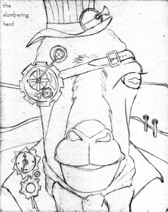
Eventually I will get to that new banner but for now I have a steampunk sheep to ink.  :o)

Steampunk Sheep (Goat?) Initial Sketch


Papyrus Font. In My Banner. Don’t Hate!

Ah, Papyrus.  Sometimes the best that is said about this creature is, “well, at least it’s not Comic Sans.” Which is true. But wait!

Having arrived here in some manner, you have likely seen the banner on this page.  Which employs Papyrus.  Of course, the text is secondary to the artwork.  And yet.  The pros and cons of using Papyrus in my banner have not kept me up at night (particularly since the beasts in my bathroom cupboard do a fine job in this area), but I have still waffled about whether to keep it up there.  Here also is my similar Etsy banner:

The Slumbering Herd Etsy Banner


On the Etsy forum recently, a designer said the following about Papyrus:

Ever have a favorite song, and then your roommate played it 2,356 times a day? …Was it still your favorite? Or did it make you want to repeatedly smack your head against the wall? (or your roommates head…) If you think Papyrus is pretty, that doesn’t mean us designers think you have bad taste. You just probably haven’t heard that song as many times as we have!

I thanked her heartily in the thread because this, finally, was a good explanation (without the snark).  A couple folks visited my banner-with-Papyrus and said it fit my style of artwork.  Not sure if those were designers or not.  Probably not.  But that’s ok!  I’m not quite sure what sort of audience this blog is intended for, but “designers” probably wouldn’t be in the top 5 100. Which is not to say some might stumble in while acting in another capacity.

I have since asked a few other folks to take a gander, and none have been horrified by my use of the dreaded Papyrus. However, I have gotten conflicting advice of another sort.  If I’m using Papyrus for my title, then the secondary text should be in a different font.  So I changed it, thinking that was pretty fine advice and that the slightly cleaner font for the rest looked quite nice!  And then another design person said omg, if you’re using Papyrus, then use it for ALL the banner text.  Well, pfffft.  I haven’t changed it back yet.  Still undecided.

In another, tangentially related note, I am still trying to unlearn that whole two-spaces-after-a-period nonsense.  Which does not do nice things to blog posts, for one thing.  Arrgh.

Do you have an opinion about this highly-charged topic?  Please share it! And thanks for dropping in – if you have a moment, let me know how you ended up here!