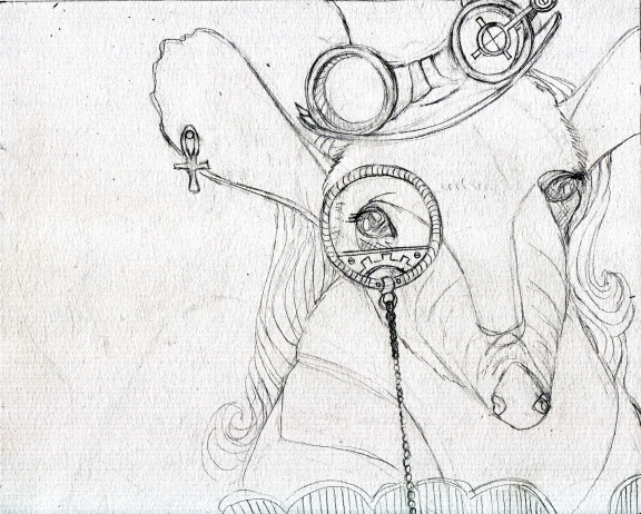
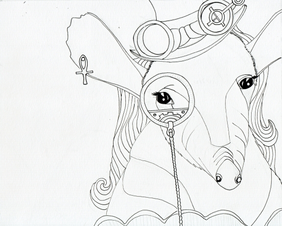
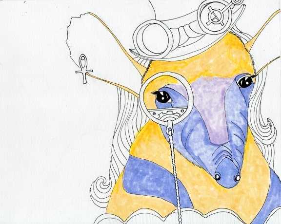
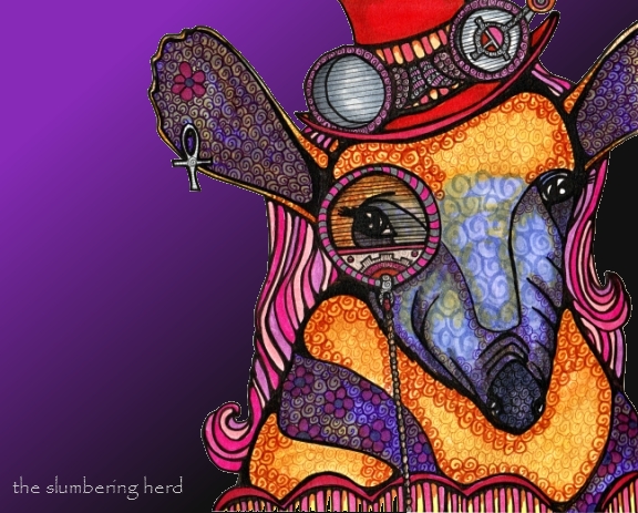
Steampunk Anteater has issues. I was planning to tell you up front, but instead I am going to post the progression photos and you get to guess the problems! (And let’s be clear, asking why I don’t do illustration digitally – thereby bypassing many of the problems to which you will shortly be witness – is not worth any points.) And now without further ado (I am actually quite fond of ado):
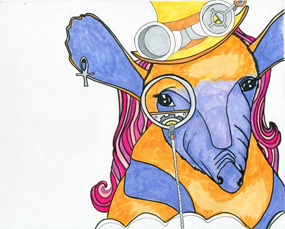
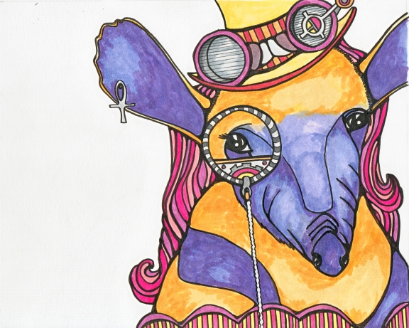
Some questionable moves up front. But that often happens! It was going to be a male but I did a male horse last. This one didn’t *have* to have hair but it does, in certain cases, help a great deal in matters of gender identity. (Also, I liked the hair on the llama and kangaroo. Used to similar purpose.)
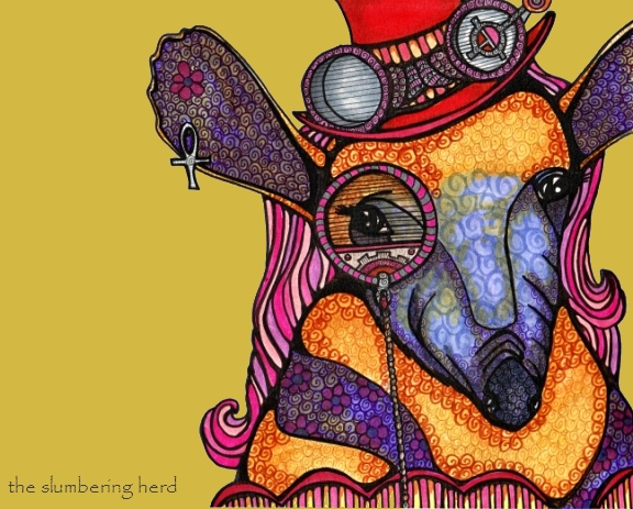
Oh, here are two versions with simple digital backgrounds that I tried in the hopes it would improve my appreciate of this poor anteater:
I do think the backgrounds improve the overall drawing, but not enough. So. Did you spot the problems? Ugh, so many:
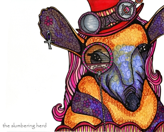
1. Not enough attention paid to gadgetry. Not sure why I lost focus there. 2. Muddying of colors. I’m just not happy with some of the color combinations, and part of that is because I tried to change the palette partway through. 3. An eyepiece without a lens. Yikes. I really needed to decide on the design of the lens instead of initially coloring the eye as if it wasn’t covered by anything. 4. The body color and hat were too close in color all the way up to the end – changing the hat to red was the last thing I did. 5. The brown I used to swirl shadows on the yellow/mustard was a really bad choice, too dark, wrong family. Arrrgh! 5. The dark stripes on the upper body look a bit like a shrug or stole. Actually, I guess I don’t mind that. But I was hoping those stripes would help identify this beast as an anteater. 6. Hair color – not sure this was the best choice. 7. I am not sure she has a lot of life to her. Sure, she may be the quiet, brooding type, but a hint of personality is always nice.
And so concludes tonight’s cautionary tale. tl;dr* – here is what we’ve learned:
Take your time. Plan ahead, at least a little. Try not to change colors midstream. Test color combinations before muddying things up! Take your time – it’s worth mentioning twice! I know deadlines can be killer but in the end, you want to be happy your name is on the thing, right?
Thank you for visiting – bonus points if you read that whole damn thing. :o)
*tl;dr – acronym for “too long, didn’t read”, i.e. here is a summary of all the preceding text that you didn’t read. [Most of you already know this, which is why I put it away from the action, in a footnote. But some of you did not know, and it is to you I direct this note. I know I appreciate it when things of which I am ignorant are spelled out, instead of the norm – which seems to say unless you know these obvious things your opinion doesn’t matter. Well listen, your opinion DOES matter. (And so concludes your positive affirmation for today.)

That’s so interesting to see your workflow! And the result is stunning.
Don’t be too hard on youself. In spite of the flaws you see, it’s still pretty damn cool!
Thanks for your visit on my blog!
Thanks for commenting on my blog, and your work is really good, Its really nice to see the many stages of it and how it develops :)
I get bonus points because I read the whole thing! I like the anteater with the purple gradient. I really do! ….and I think I just really like that you did an anteater!
Well, I DID read the whole thing too, and it’s kindof funny because while you are cringing from what you consider the picture’s “faults”, someone coming in and just looking at it doesn’t really notice all that. I think it looks pretty great. I really like the rich colors, and especially the wonderful textures, and if there are a few “oddities”, well, they’re just part of the picture.
But I know what you mean….and I think we HAVE to be critical of our own work, as a means of improving.
The only thing about this illustration that “bothers” me (and it’s really a very minor thing) is that the background doesn’t have any of the richness of the figure, and thus doesn’t seem to really belong to the same space as the figure. It seems like it could use a tiny bit of the same kind of texture that the figure has to kindof unify it a little bit.
But I really really like the overall effect, and the wonderful colors, and the interesting character in all its details.
Haha, wow, thank you Leslie and TMartin for reading the whole thing! I see blogs where folks post a picture with no text at all, some with just a little text, and then short novellas like mine. (You should have seen some of my early posts! A whole series of artwork I sent out for prints for my shop, in one post. (And then nothing for a week and a half.) Hopefully I have learned a few things along the way – not just art technique but blog technique. :)
If folks don’t have the time to read these drawn out expositions, of course comments on the artwork alone are also very welcome!
I honestly think you are being too hard on yourself about your “faults”. If I had to pick anything to change — I’d go with the adding some textures to the background — perhaps in a subtle olive green. But again, I see no faults… only beauty. Nice work!
Hej Cindy, just a quick comment to let you know I think your critters are awesome (why didn’t I click your link earlier?)! I like their expressions very much, and they do make me smile (which I think is so much more important than technical perfection – seeing by just looking at a picture that you like what you do and that there is a certain warmth that shines through)… they would fit pretty well into some Mary Poppins’ world (and maybe in her famous carpet bag, sticking out their little heads every now and then), wouldn’t they? :)
Hi Iris, nice to see you! Oh my goodness, I think any of these beasty critters would absolutely love dancing around (or at least rubbing elbows with some Brits) in Mary Poppins world. They might cause some trouble, but they would be in good company. Thank you for the lovely comment!