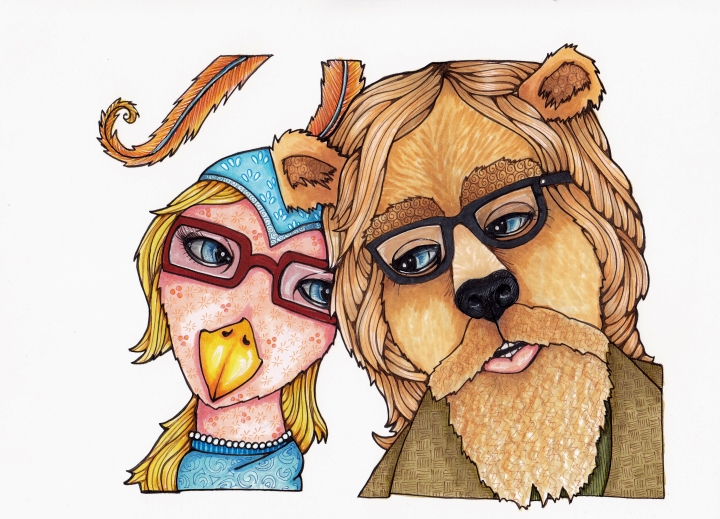
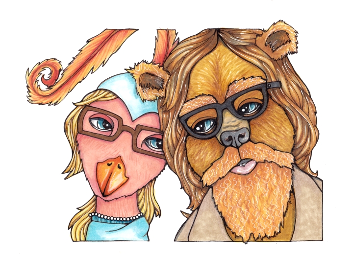
Tag Archives: illustration

Halloween-ish Cityscapes

Witchy Boot Village
2.5″ x 3.5″ Copics, fine liners, white gel pen

It’s back to the cityscapes around here, with a bit of Halloween flare. The 100 Cityscapes Project is up to 25! My favorite bit is probably the candy corn mailbox.

Hattown
2.5″ x 3.5″ Copics, fine liners, white gel pen

Also, hat houses. With tiny hat house numbers. Sort of Halloweenish.

Snowglobe City
2.5″ X 3.5″ Copics, fine liners, white gel pen

One more, not very Halloweenish. Done about the same time as the City in a Bottle. I should really look into doing proper light reflections on glass. At some point. If you know some good resources for learning about light reflections on glass, please share!

Thanks for dropping in!

[portfolio_slideshow size =”large”]


Bird and Bear Portrait Project, Copics

Bird and Bear
9″ x 12″, Copic markers on 150 lb smooth drawing paper

This is the final version of a commissioned portrait for a quirky bird girl and burly bear guy, getting married in about three weeks. The project took closer to three months. Most of that time was filled with mild panic and her unhelpful cousin, procrastination. Hooray!

I don’t do portraits, neither people nor pets. But I often do beasts, and often in clothes. So I figured I would give it a shot, with my friend’s promise he would not take it if he did not want it.

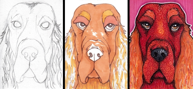
Three items were produced for this project. A pencil sketch, which I chose not to ink over – sort of a contingency plan in case the inking never worked out quite right:

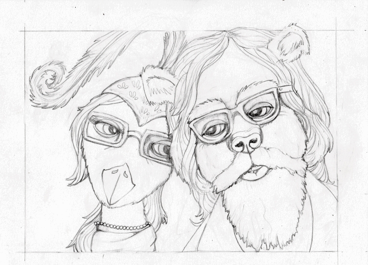
Final sketch, Bird and Bear

I was worried about two things. One, that all the erasing would affect the marker coverage, and two, that I wouldn’t be able to reproduce the image as well again if I mucked it up.

So, I bought my first lightbox (with a 40% off one item coupon at my local Dick Blick’s) and used that to ink a clean sheet. Actually, I should back up a moment. I also used the lightbox to reduce the size of the image, by scanning it, shrinking it by a couple inches, printing it, then re-creating the pencil sketch, but smaller and with better detail. THEN I got another clean sheet and started inking.

The first inked version got off to a bad start when I made his pupils too big. Then I overworked the thing to death trying to adjust the colors.

Bird and Bear, first color version

Still, I could have stopped here, finished it in a bit more, and called it a day. But his hair is too dark and his snout far too short. And her feather too long. So I inked a whole new one and started over. And it not only went far more quickly than the first, it came out much better. (I think.) Yay!

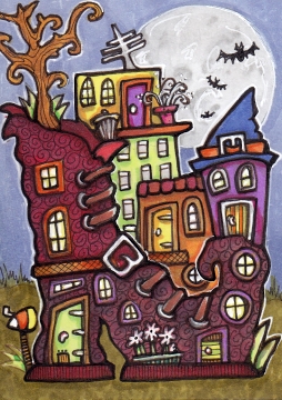
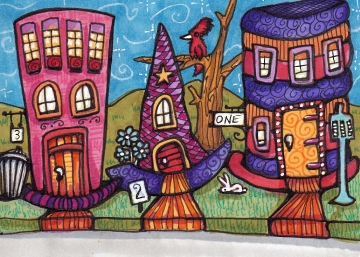
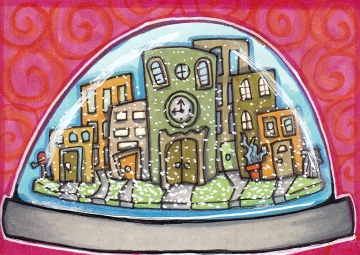
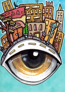
Lots of progress pics, including some early bird and bear sketches. Thanks for visiting!

[portfolio_slideshow size=”large”]

Micro Cityscapes in Pen & Ink

Eyeline
2.5″ x 3.5″ Copics, fine liners, gel pen

I like this one because I remembered to add the little streetlamp, and potted plants, and a tree, and of course the garbage can. Which may not be a garbage can at all. Perhaps it’s a portal connecting all the garbage cans in all the micro cities.

With that in mind, I shall submit this post for the Illustration Friday topic “Hidden”, for the hidden garbage can portals. Which I didn’t even know about until I wrote this post!

Bottled City
2.5″ x 3.5″ Copics, fine liners, gel pen

See, there’s another one! These are cities number 19 and 20, of my 100 Cityscapes Project. One or both may end up in my shop.

Thanks for stopping by!

[portfolio_slideshow size=”large”]


Maiden Cityscape Mash-up, in Markers

Her City Hair, and Village of the Mind
Each 2.5″ x 3.5″ Copics, fine liners, white gel pen

These started with an intuitive face (see last post!), and ended with a cityscape. I suspect the continued blending of subjects shall occur for some time! In addition, here is the threatened dog plus cityscape, and a bonsai community.

Blue Dog City, and Bonsai Town
Each 2.5″ x 3.5″ art cards, Copic markers

Have you done any goofy mash-ups lately?

[portfolio_slideshow size=”large”]

Red Setter in Copic Markers

Red Setter Called Waldorf, process and final
2.5″ x 3.5″ Copic markers, fine liners, gel pen

Waldorf was a reader from a very young age. At three he was a fan of White Fang and the Jim Kjelgaard series of dog books. But lately he prefers such diverse topics as Nordic legends and artisan cheese making, with the occasional Philip K. Dick.

If you were a reader and a dog lover like me as a youngin, you probably read some Jim Kjelgaard. We had an Irish Setter named Rusty, and as a result I was particularly fond of the Big Red, Irish Red and Outlaw Red books, but also Snow Dog and Desert Dog. I was also a huge fan (and cried frequently!) over White Fang by Jack London. The other dog book I remember fondly is Champion Dog: Prince Tom by Jean Fritz, the uplifting tale of a scrawny Cocker Spaniel runt who grew up to be a champion many times over.

Made for a trade at illustratedatcs.com. Did you have favorite dog books as a young person?

Beautiful reference photo, (a Gordon Setter). Thanks for stopping in!

[portfolio_slideshow size=”large”]

The Peace Flower, Inspired by the East

The Peace Flower
5″ x 7″, Copics, Microns, gel pen on Bristol Board

This Peace Flower is a peaceful protest design which offers a large flower in place of the warrior who would normally be riding this elephant, perhaps across an Indian countryside. The background was inspired by mehndi design (henna design), most traditionally used to decorate the hands and feet of Hindu brides, or for other festive occasions.

Submitted for the topic “Protest” at Illustration Friday. [Actually made for a friend who may or may not see this post before the item arrives at her house. But it was too good for the topic to pass up! Ok, really I kind of shoe-horned it into the topic. But still!] I’m not sure if the entire background should have been red. Didn’t want to risk it.

Thank you for your visit!

[portfolio_slideshow size=”large”]

Two Bright Birds, One Goldfish, Marker and Ink

Maureen in the Jungle
2.5″ x 3.5″ Copics, fine liners, white gel pen

Two more colorful birds created for a Birds swap (first two posted previously). Maureen is a little bit Hornbill and a little bit Heron, with a possible side of Flamingo. She is one of a small flock of magical, long-lived creatures who live in villages atop clouds. This may be my favorite background!

Lionel Shoebill
2.5″ x 3.5′ Copics, fine liners, white gel pen

Lionel comes from a long line of strangely-colored shoebills. The color always passes down to the male members of the family (much to the chagrin of his sisters). Family legend suggests that a great-great-great uncle was a Toucan, but really, how would that be possible? (Answer: Nature finds a way!)

Hannah the Goldfish
2.5″ x 3.5″ Copics, fine liners, white gel pen

And finally, Hannah the goldfish. It’s quite different than previous goldfish, but thankfully the client was happy. Her mom said Hannah got loads of positive comments on Fishbook and was thrilled and also quite touched, especially because she got teased a lot for her spots when she was little.

Thanks for visiting! Progress pics below.

[portfolio_slideshow size=”large”]

Stippled Ammonite Lizard

The Ammonite Lizard, 5″ x 7″
Copic markers with 1.0 Micron pen

Created as a Secret Solstice gift for a very cool dollmaker artist called Ruth Morris. Here is her website! And here is the Sumner & Dene Gallery with more of her totally fun and brilliant and odd dolls! I happen to also be the lucky guardian of a Lion Shaman doll and a Fairy doll.

All of the ink is done in stippling. Something I had not done in one, possibly two decades!  But I think it went pretty well. I did go back with my trusty Signo Uniball white gel pen for some highlights. Tons of progress pics below, as well as some close-ups.

Thanks to everyone who provided feedback about posting frequency and blog things from my last post. I am aiming for twice a week. Thanks so much for stopping in – comments and questions are very welcome!

Ammonite reference photo.

[portfolio_slideshow size=”large”]

Maiden of the Birds for Illustration Friday

Maiden of the Birds
5″ x 7″, Copic markers, Micron pens, Uniball Signo gel pen

Submitted for the topic “Tension” at Illustration Friday. That’s Phyllis up there, the sheep bird. And beside her, Jules (pink) and Harold. The little one on the bird feeder is Sybil. It looks calm right now, but Phyllis rules the place with an iron claw. Particularly if someone else has encroached upon what she feels is the proper amount of space for a creature of her stature. It can get a bit tense up there!

The Night City Maiden (2 versions)
5″ x 7″ Copic markers, Micron pens

I intended for this one to have a black background, but I am not sure about the best way to accomplish that. The dark version above has a simple a black background added digitally. Looking at these side by side, it definitely looks better dark, especially with the stars. I suppose a brush would do the best coverage, and I may even have one, and some ink. I hate to think of coloring the background with marker. But brushed ink is likely to warp the paper.  Eeek! If you have any tips, please share!

No progress pics because I did both of these while out of town! (It also explains the color palette, which was limited by what I brought with me!) These are maidens 95 and 96 (but might not be loaded over there yet). Thanks for stopping in!


People of the Forest Redux, Copic Art Cards

People of the Forest Art Cards, Group 2
Each 2.5″ x 3.5″, Copics, Microns, Staedtlers and Signo Uniball gel pen

Top row: Silver Pixie Princess, and Bear the Wise

2nd Row: A Flower Fairy, and a Fae Tracker

You may recall I was on a bit of a tear with Dog Art Cards for a while (and to which I will yet return!) At the moment, if you hadn’t guessed, it’s this fantasy/woodland theme, People of the Forest. And as I suspect there will be many more in the foreseeable future, I am submitting this post to “Future” at Illustration Friday!

I was working on eyes for a while, and I really need to work on noses. I am quite pleased with the Silver Sprite above, my first of the nose studies. In trying to replicate that nose, I had a lot of trouble with the Fern Fairies, below:

Two Fern Fairies, and Nose Troubles
Each 2.5″ x 3.5″ Copics, etc

The one on the right came first, and I have yet to do an acceptable nose repair job on her. I started with a too dark (and imprecise!) ink line on the bridge of her nose, then kept going darker trying to fix or cover it. Aaaah! For the second attempt (on the left) I went with a lighter touch, and a much better result. Some inspiration for these two came from Lisa Ferguson’s fairies, which I love!

Thanks so much for visiting! More People of the Forest cards in my illustratedatcs gallery, if you’re interested. Some may end up in my shop. :)

[portfolio_slideshow size=”large”]