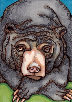
Sun Bear Art Card
2.5″ x 3.5″ Copics, fine liners
Ok, he may not be traditionally sweet, but I think he has a sweet face! Due to some trading requests I’ve done a bit of (pseudo) realism this week! And it’s always sweet (sometimes bittersweet!) to go outside our comfort zone. Submitted, as you may have guessed, for the topic “Sweet” at Illustration Friday.
I have been paying more attention to my process recently. I do a lot of layers with the markers, which not only helps in removing dreaded marker lines, but also results in some really nice blending. I counted the pens I used for this guy. 24! Two sizes of fine liner (0.05 and 2.0), a little bit of Uniball Signo white gel pen, and 21 Copics! Mostly browns and grays, with several orange, two blues and two greens.
Am I relying too much on different marker colors? Could I achieve the same result with fewer? Who knows! I can only do things the way I do ’em! (You will see that many of the colors disappear completely in the scans below.) I could have darkened some more shadows but have been trying to stop messing about with things before I wreck them. Here’s the reference photo.
And now, if beetles can be sweet, how about this guy?
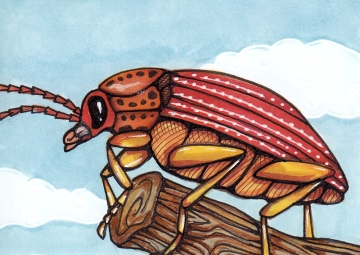
Orange Wonder Beetle Art Card
2.5″ x 3.5″ Copics, fine liners, white gel pen
This fellow was created by looking at this photo of a gray beetle. I tried to give it a name that suited its beetley charm. A beetle against the sky – he could be huge! Or tiny.
Thanks so much for visiting! I should have captured some more progress on the beetle but did a pretty fair job for the bear.
[portfolio_slideshow size=”large”]