Category Archives: Progression Photos

Stripe and Bustle for IF Friday with Progress Pics

Stripe and Bustle

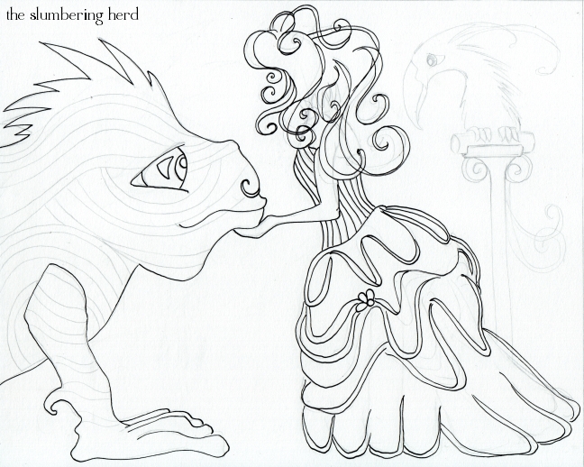
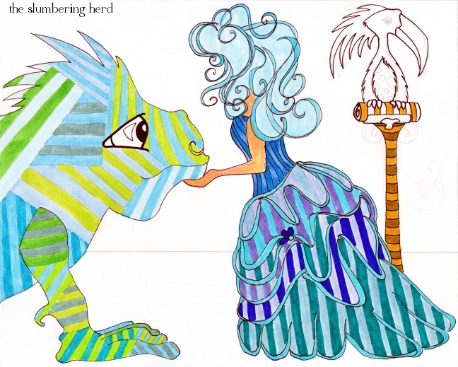
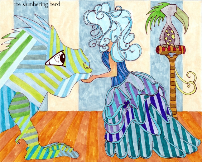
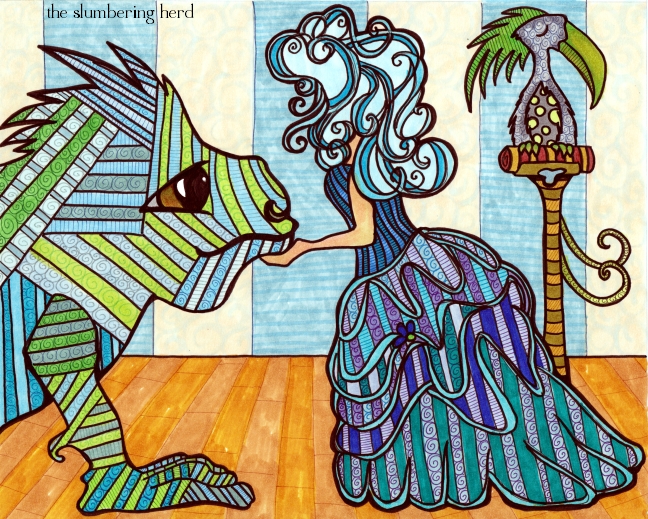
Busy, stripey, slightly mysterious thing for the Illustration Friday topic “Stripes”.  I have wanted to do a bustle for ages but was afraid.  Pfft, was not very hard and I am quite happy with it.  Still avoiding faces though, which led to a cool and successful hairdo. The stripey beast is rather flat, which was the original intention, but it doesn’t seem to go with the rest. Also, did a pretty bad job on his eye.  Arrrgh! Progress photos below.

Stripe and Bustle Sketched

Stripe and Bustle Color 1

Stripe and Bustle Color 2

Stripe and Bustle With Copics, 8x10 Illustration

No story at the moment, though I may yet add one. Thank you for visiting!  Did you do Illustration Friday this week?  Drop a line so I can go see.  ;)

One Dapper Monkey for November Whimsy

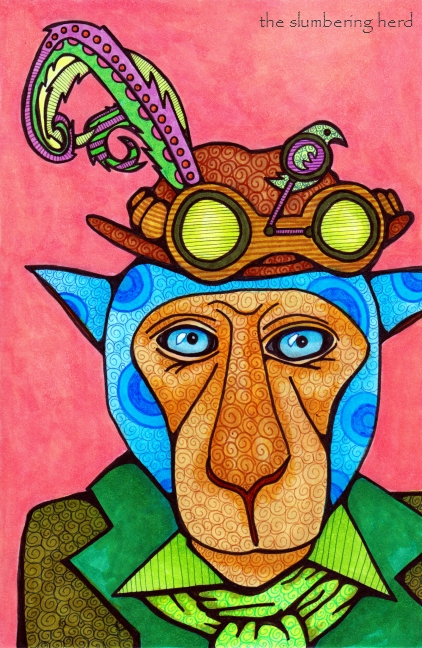
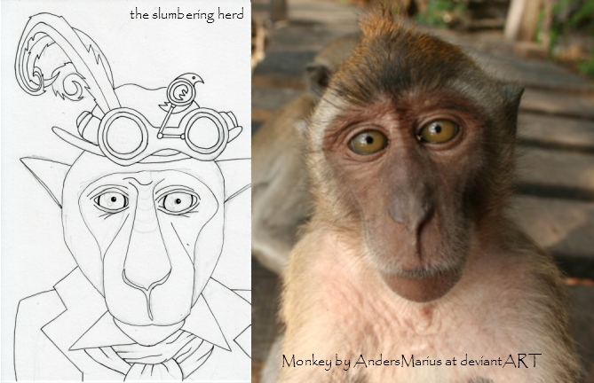
It’s Whimsy time again, and this month’s prompt is “panache”. I wondered if it might have a less well-known definition I could use.  Well as it happens, it does! (Although it isn’t such a stretch from the original meaning, as evidenced in the dapper creature below.)

panache – 2. an ornamental plume of feathers, tassels, or the like, especially one worn on a helmet or cap. (Thanks, dictionary.com!)

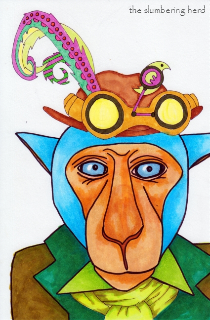
One Dapper Monkey

Sadly, I forgot about the tassels until I was too far in.  Also, I probably should have left Wilbert a fluffier/fuzzier type of dapper monkey (instead of a monkey who could possibly be wearing a blue bike or space helmet, or shower cap.)

Wilbert is quite a world traveler and loves to visit local markets in all the corners of the world.  He keeps a home in Scotland because he has approximately two and one half rooms full of hats, most with panache! One of his traveling hobbies is collecting feathers from the wilds of the world.  He only uses found feathers (as in, not currently being used/worn by a bird), and has perfected a method of cleaning them and returning them to their full glory.  Determining which hat a particular feather suits best takes an average of three weeks.

Dapper Monkey and Thai Monkey

I found the inspirational Monkey photo at deviantART (photographer: AndersMarius). He met this fine monkey in Thailand. Doesn’t he look wise? And slightly amused? And nice. (Though he may be none of these things.)

Dapper Monkey Color 1

One Dapper Monkey

Original 9″ x 6″ original illustration with Copic markers. I finally did a background! (Partly because the background was much smaller than with previous projects, and would not use up so much marker fluid.  I was going to pattern the background but decided for now there is enough pattern on Mr. Dapper.)

Thank you for visiting.  My goodness I have been posting like a fiend recently.  It probably won’t last!  Need sleep.  Thank you for stopping in!

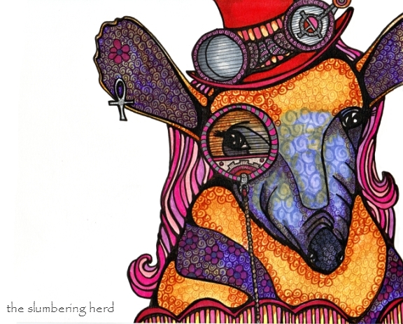
Steampunk Anteater, a Cautionary Tale (with Progress Photos!)

Steampunk Anteater has issues.  I was planning to tell you up front, but instead I am going to post the progression photos and you get to guess the problems! (And let’s be clear, asking why I don’t do illustration digitally – thereby bypassing many of the problems to which you will shortly be witness – is not worth any points.) And now without further ado (I am actually quite fond of ado):

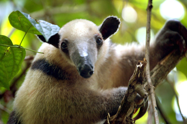
Tree Anteater by Maladjusted-Platypus at deviantART

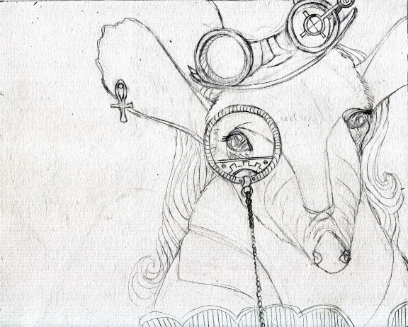
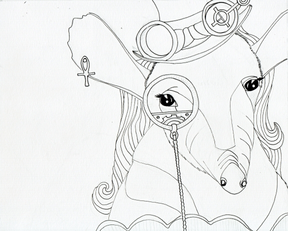
Steampunk Anteater sketch

Some questionable moves up front. But that often happens! It was going to be a male but I did a male horse last. This one didn’t *have* to have hair but it does, in certain cases, help a great deal in matters of gender identity. (Also, I liked the hair on the llama and kangaroo. Used to similar purpose.)

Steampunk Anteater ink

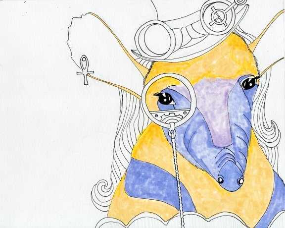
Steampunk Anteater color 1


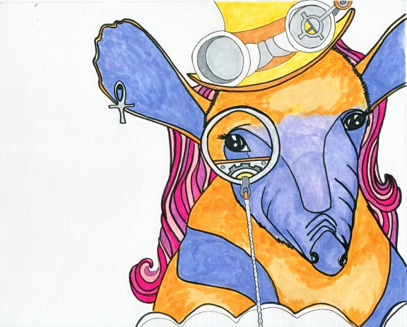
Steampunk Anteater color 2

Steampunk Anteater color 3

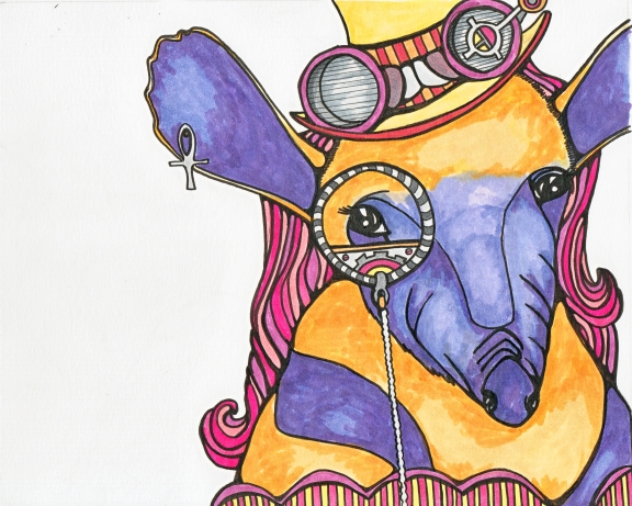
Steampunk Anteater Final (?)

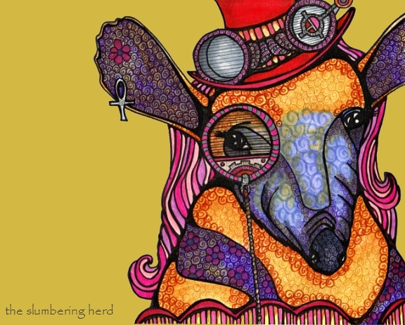
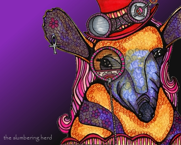
Oh, here are two versions with simple digital backgrounds that I tried in the hopes it would improve my appreciate of this poor anteater:

Steampunk Anteater, Mustard Background

Steampunk Anteater, Purple Gradient

I do think the backgrounds improve the overall drawing, but not enough. So. Did you spot the problems? Ugh, so many:

1. Not enough attention paid to gadgetry. Not sure why I lost focus there. 2. Muddying of colors. I’m just not happy with some of the color combinations, and part of that is because I tried to change the palette partway through. 3. An eyepiece without a lens.  Yikes.  I really needed to decide on the design of the lens instead of initially coloring the eye as if it wasn’t covered by anything. 4. The body color and hat were too close in color all the way up to the end – changing the hat to red was the last thing I did. 5. The brown I used to swirl shadows on the yellow/mustard was a really bad choice, too dark, wrong family.  Arrrgh! 5. The dark stripes on the upper body look a bit like a shrug or stole.  Actually, I guess I don’t mind that. But I was hoping those stripes would help identify this  beast as an anteater.   6. Hair color – not sure this was the best choice. 7. I am not sure she has a lot of life to her.  Sure, she may be the quiet, brooding type, but a hint of personality is always nice.

And so concludes tonight’s cautionary tale.  tl;dr* – here is what we’ve learned:

Take your time. Plan ahead, at least a little. Try not to change colors midstream. Test color combinations before muddying things up! Take your time – it’s worth mentioning twice!  I know deadlines can be killer but in the end, you want to be happy your name is on the thing, right?

Thank you for visiting – bonus points if you read that whole damn thing. :o)

*tl;dr – acronym for “too long, didn’t read”, i.e. here is a summary of all the preceding text that you didn’t read. [Most of you already know this, which is why I put it away from the action, in a footnote. But some of you did not know, and it is to you I direct this note. I know I appreciate it when things of which I am ignorant are spelled out, instead of the norm – which seems to say unless you know these obvious things your opinion doesn’t matter.  Well listen, your opinion DOES matter.  (And so concludes your positive affirmation for today.)

Illustration Friday – Shadow Puppets and a Wild Imagination

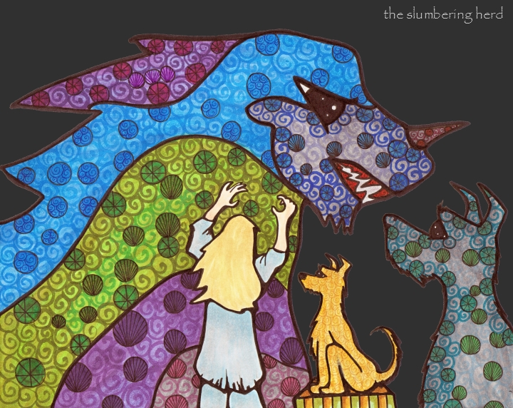
It’s Illustration Friday again. Today, in fact, and the topic is “Scary”. As I begin this post, there are already 153 entries on the list. Yikes! I didn’t actually check last time – (last week – Fuel – being my first IF week, woooo!). Last week I did my illustration on Saturday. But this week, because I have other plans for Saturday, I started when I got home from work and now I am done. (I think some of it must be the enthusiasm of a noob. I’m ok with that.)

Not the Shadows She Expected

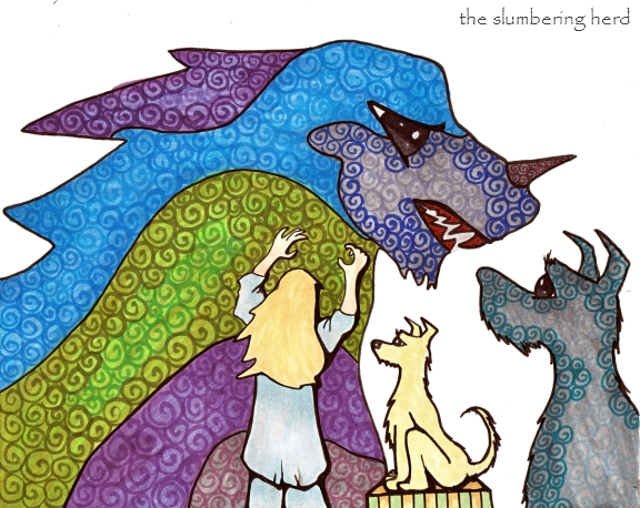
Last week, the topic inspired a drawing that in turn inspired a little story with a lot of potential. This week, the topic inspired some stylistic choices outside my standard repertoire (darker colors – though maybe not even dark enough for shadows, and people – I have a hard time doing people!  I have cleverly avoided having to do the face, as you can see). I’ve yet to declare a verdict on its success (or lack thereof).  I’m leaning toward “lack thereof” but I did do a few new effects I rather like and will use again.


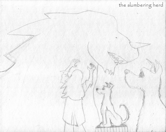
Shadows and Imagination Sketch

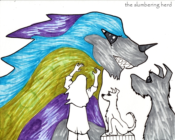
Shadows and Imagination Color 1

Shadows and Imagination Color 2

Not the Shadows She Expected

Original 8″ x 10″ Illustration with Copic Markers and pens on Illustration board. The background and a few minor adjustments were done digitally. I was going to scrawl some text across the dark spots, something like:

“Stop trying to scare the dog!”

“Oh my god I’m not trying to scare the dog!”

Aren’t dogs the best? (If you happen to need a dose of the cutest dog on the planet, feel free to look at a few choice photos of Wilson, a.k.a. Boo.)

Odd Thing in the Cupboard, a Progression Post

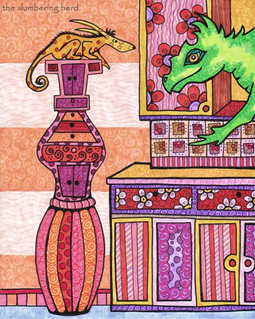
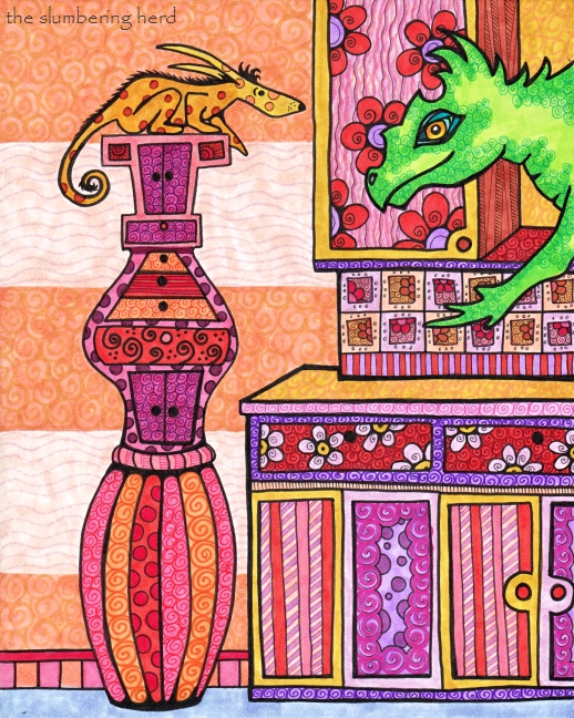
Odd Thing in the Cupboard

So, the theme for a team challenge at Etsy was “The Thing in the Cupboard” – and this is what happened. I wasn’t too happy with the sketch but I didn’t have another idea immediately, so I just kept at it. Here’s the unimpressive sketch:

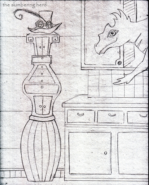
In the Cupboard, Sketch

I don’t even know what that is.  Some kind of lopsided, gypsy-styled, alchemy chest (with a vaguely steampunk hat on top) – a thing with potential but poorly executed. And why is it in the corner of the kitchen? The whole thing got worse before it got better, with a bit of color. (Copic markers and pens, of course).

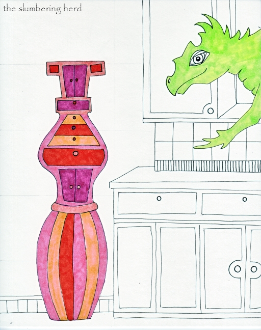
In the Cupboard, Color 1

So, I used a ruler for the cabinet/counter, but didn’t use any rulers for inking. Which shows. I know it. Maybe next time I’ll go with the ruler. But with more color and more detail it was beginning to have a little personality.

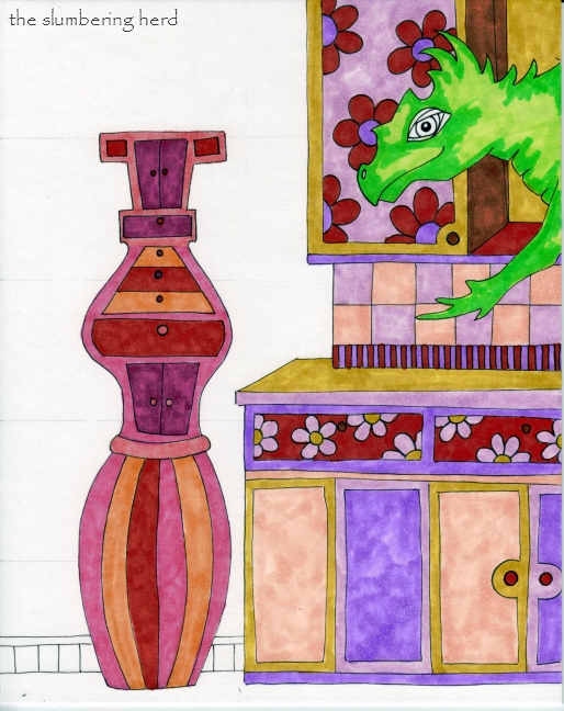
In the Cupboard, Color 2

And then more detail.  I particularly like (as I’ve said a few times), fine details in colors similar to the background color. There is probably a better, simpler and/or more technical way to say that (Feel free to share, if you know it!).

I have a fair number of colored fine liners.  I have the primary Copic colors mostly, but also some Micron and Prismacolor fine liners.  I need a few more colors.

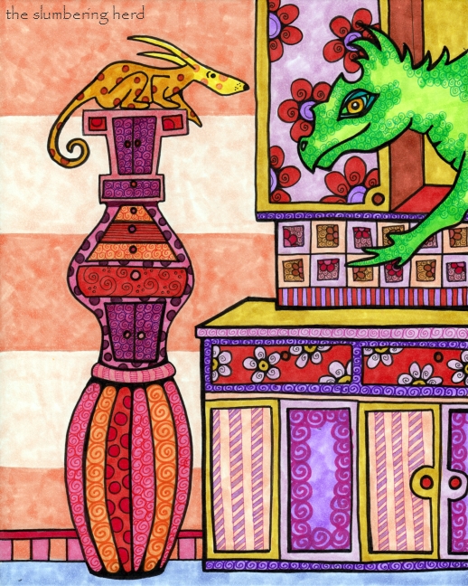
In the Cupboard, Color 3

I have to say I am a big fan of these colors.  I wish the scans were more consistent, but that’s mainly user error. Even so, I’m so pleased I have this scanner (acquired recently for a very reasonable price, though it only does letter size) because, as I’ve mentioned once or twice, I love progression picture posts!

(Click to Enlarge)

An Odd Thing in the Cupboard or, Attempts to Avert Crockery Disaster

The spotted critter on the left, a Leaper named Cymbal, is the familiar of a very accomplished conjurer. She has quite a few magical skills of her own, and so is not particularly unnerved by the unusually large reptile materializing out of the kitchen cupboard.  In fact, she is not even remotely unnerved by these developments because this particular reptile is only the third largest creature to materialize in the kitchen this month.

For the creature, however, it can be a bit of a shock to find oneself in a stranger’s kitchen, and Cymbal wants to try and sooth the beast before he starts pulverizing the crockery. Cymbal’s job involves far more unglamorous crockery cleanup than she would prefer.

Illustration Friday and a Strange Goat

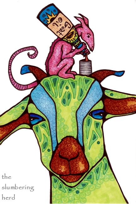
My first entry for Illustration Friday.  This week’s topic:  FUEL.

My first thought was to do a robot shaking an empty gas or oil can into his mouth (or into a receptacle on his head, or wherever the oil entry point might be).  But I have been on a colorful farm animal kick (most recently steampunk farm animals, several of which you can find in recent posts!), and I have been liking goats. So I thought, what silly thing can I show a goat eating?  Perhaps some long johns or socks. So I had a plan.

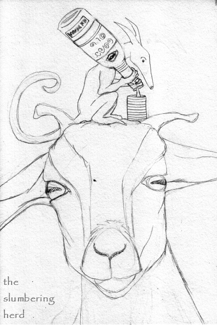
As you will see, this plan fell apart during sketching. I did not leave enough room for a recognizable sock at the bottom (not a giant one like I wanted) but I did leave some room at the top.  So clearly the fueling would have to take place above.  I thought about giving him a beer hat contraption (ah, a few weeks late for that topic, I know!), maybe with something silly in it like orange juice. But I didn’t want to cover his face with a straw.  So I decided another creature would be on top of his head, fueling him through a pipe in his head.  I’m not sure why I thought this! Here is the result:

Green Goat Fueling Up

This seems to me prime fodder for a trick I found while browsing last week’s entries: Bella Sinclair’s Doodlespot, in fact, in the following query to her readers, “What do you think is going on here?” So, I would do that, except I am a first timer to IF and I do not know if people will get a chance to visit me, straggler entrant #673 or whatever number it may be.  (But if you do, feel free to let me know what you think is going on in this picture!)

If you have been kind enough to visit and read this far and don’t want to have to come up with a story for the above, this is how I see it:

The pink creature is one of many thousands of similar creatures on a small planet really, really far away.  About four hundred years ago (our time), a garbage scow from earth was picked up by this civilization, and the only item they kept was an old picture album depicting life on a farm. They were completely enchanted by the farm animals, which became very popular subjects for their art.  So popular, in fact, that when the time came to re-design the planet’s power plant, they used goats, chickens, and llamas as decorative statuary to hold the massive tanks and wiring.  In the picture above, one of these enormous goats is getting a shot of oil that will keep him in perfect working order for another seven months or so.

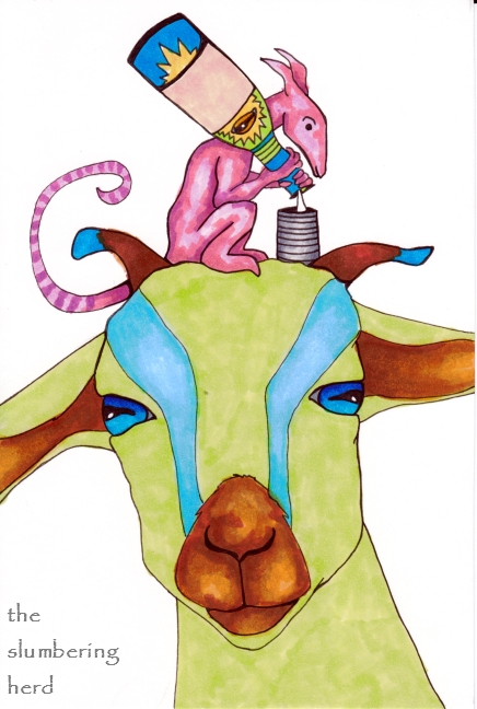
Oh! (Sorry, this is probably too long, lol) I wanted to post the initial sketch and some early coloring (with Copic markers):

Topic Fuel - Initial Sketch


Topic Fuel - Color Progress

I used Copic markers and pens for this 6″ x 9″ drawing on 150 lb. smooth drawing paper.  Thank you so, so much for dropping in!

Steampunk Horse with Copic Markers

Steampunk Donkey Horse Original Art


Seriously cool update: Ok, so the seriously cool Copic folks actually used this post (most of it, plus some other things) as a tutorial on Copic’s official site!

More steampunk.  More Copics.  Another progression photo post! As you can see, the colors are somewhat more subdued than they have been, which was a conscious choice in an effort to replicate a little bit of the flavor of older, maybe even colorized, photography.  This horse is not living in modern times, after all!
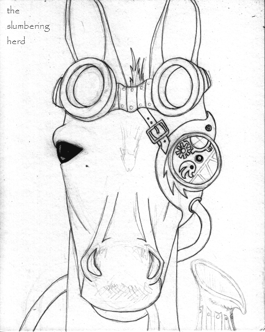
Figure One - Steampunk Donkey Horse Ink

I was referencing a photo of a donkey but as I said in the last post, the narrowing of the face seems to have made a horse instead. I added a pipe but I was not sold on it yet, so it isn’t actually inked in Figure One. (Ha!  Figure One!  Delusions of text-bookishness? I think I will use it for the whole post and try to decide its dork quotient.)

Initial ink with a 0.1 multiliner SP. I actually had to replace the nib in my 0.1 after using it for about a day, but I learned my lesson! It seems I’m rather hard on all my pens and markers, which seems to be part of my style, but I don’t recommend it.
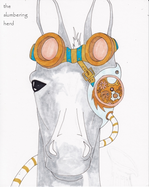
Figure Two. Steampunk Horse Color One

Figure two.  Initial application of Copic color.  I don’t own as many greys as I would like (are you a “gray” or a “grey” person?). This will be N1 and N4, and the browns and blues are Y26 (Mustard, love it!), Yr24, E35, B04 and BG000. The peachy color is E93 (Tea Rose, another favorite).
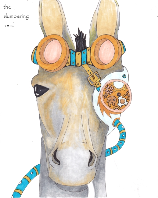
Figure 3. Steampunk Horse Color 2

More of the same colors, with a couple more greys C-3 and C-5 (but I only have Ciaos and they are running out!) I started using the Colorless Blender (Sketch size, which I believe I got in the Blending set.  Used a 40% off one item coupon at Blick’s for that set!) You can’t buy the Sketch size Colorless Blender, just the Ciao (at my Blick’s, anyway).

Added some YR12 and YR23 to the E93 try to capture that strange reddish, yellowish tinge to a donkey’s face.  Yes, I’m still working with a photo of a donkey for my horse.
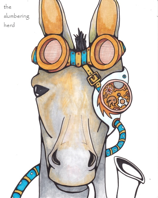
Figure 4. Steampunk Horse Ink 2

One of my favorite parts is the initial outline with a 0.8 multiliner when the drawing begins to come more to life. Also 0.3 and 0.1 for some details – and inked the pipe so now I’m stuck with it! It’s a little too low in the frame and I wish I had more space for more of the barrel of the pipe.
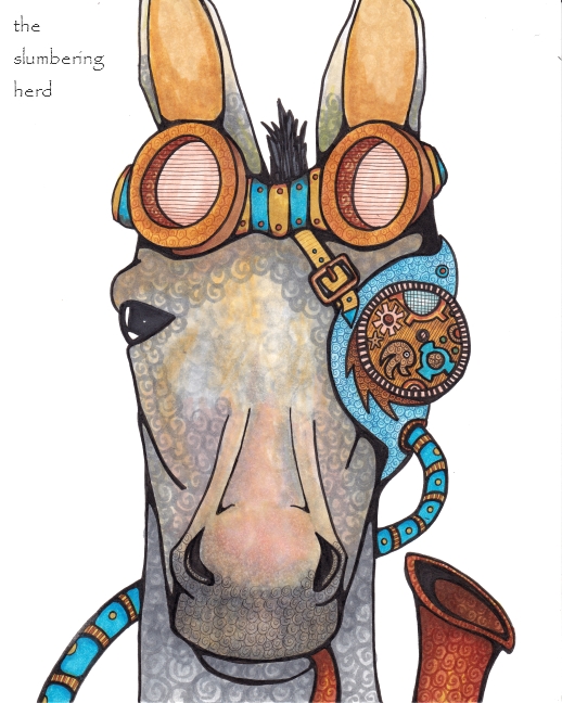
Figure 5. Steampunk Horse Color 3

Additional browns added: E08 and E53. Although I always do the swirl pattern, I often add some flowers.  I decided to forego the flowers this time and see about doing only swirl patterns – the idea being that the eye piece, the goggles, the pipe and the tubing would be enough in the way of finer detail. Started adding even finer detail with the 0.05 multiliner SP (I have a few SPs, but mostly the disposal multiliners currently.)  You can see the 0.05 in the horizontal lines on the goggle lenses and on the eyepiece.

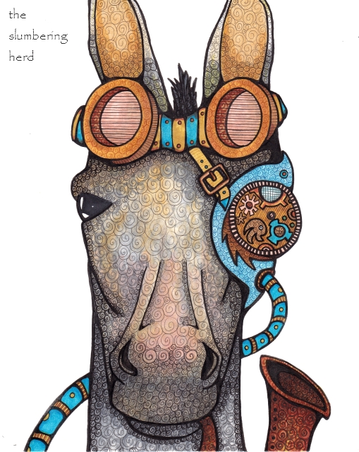
Figure 6. Steampunk Donkey Horse Original Art

Went a little swirl-nutty.  One effect I particularly like is a colored multiliner over marker from the same color family, like on the bird’s body of the eyepiece.  Also used some sepia multiliner on the goggles. I added a little B02 (Robin’s Egg Blue) to add a little depth to the blue. Tightened up some more details, then did the swirl thing with the 0.3, 0.1 and 0.05. Sometimes in the same place, if the color effect wasn’t as dark as I wanted. And though I usually leave some light spots with no swirls, the swirl-nutty fever was on me and I swirled the whole damn thing up (with the minor exceptions of the goggle band and metal tubing.)

I like the effect of the subdued colors. As usual I am not sure about whether I want a background. At one point toward the end, I had actually sketched out a stripey design for the background, intending to use only black multiliner detail for the entire background, but then I decided against it. Holy cow, long post. Thank you for sticking around! What do you think, compared to my others (if you’ve seen them)?

A Step-by-Step Copic ACEO Post

Some of my favorite blog posts are the kind that show the stages of a project from beginning to end.  So I’m having a go with my recent obsession – ACEOs (Art Card Edition Originals) created with Micron fine line pens and Copic alcohol-based professional markers.  Please feel free, should you stumble upon this post, to offer comments, criticisms or suggestions.  I can take it.  ;)

Please note I in no way resemble a Copic expert.  I wouldn’t even call myself proficient.  So this is clearly not a how-to post, although I suppose it is a how-to-if-you-are-me-today post.

One thing I’ve noticed is that I don’t get discouraged as easily as I once did, abandoning pieces before they have a chance to develop a personality.  These days I try to be more patient.  So let’s start here:

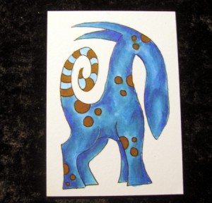
Step One

I sketch in pencil first almost always these days.  For a long time I didn’t sketch beforehand at all, and it led to a lot of wasted paper and no small amount of frustration.  I still doodle a lot without sketching first, but mostly I do a basic outline of a beast – particularly the legs (for alignment), nose (which makes a big difference in a beast’s personality), hair/spines (because it’s easy to accidentally make each piece  too similar, which is not an effect I generally like) and ears (which also affect personality).  I could have added a forelock but I wanted more white space.

Step Two

Just a simple line outline.  After I’ve given it a few moments, I erase the pencil lines with my handy Staedtler Mars plastic eraser.  I don’t even mind if the eraser fades out the ink at this point, because I’ll be going back over it at the end.

Another thing I notice and if you have been a doodler of any sort for any length of time you probably notice the same thing, and that is that I don’t hesitate like I used to with pen line.  So you don’t see a lot of starts and stops with little bits of line trying to line up.

Step Three

A basic covering with the lightest blue.  The opposite side legs and ear start off one step darker.  I tend to dab a lot to try to avoid lines in the marker coverage.  I also like to leave some white space to add depth in subsequent layers.

I should add here that the thing about not hesitating with pen is not serving me quite so well with the markers, which do have a nice brush tip but I haven’t trained myself to slow down quite enough (particularly with tiny ACEOs!) and I manage to color outside the lines with some frequency.  :D

Step Four

I decided a bit late to add some detail.  I forgot I wanted to do a striped tail but better late than never!  As long as I didn’t have my heart set on light colors that the light blue would bleed through, this isn’t a big deal.

Step Five

Decided on brown for the spots which covered the blue easily.  Did some sketchy shading with my next blue.

Step Six

The photo is a tad blurry but I went back over the beast with the first (lightest blue) which softened the transitions.

Step Seven

The next darkest blue.  As you can see, I am missing many shades of blue in between, but I am making do with the colors I have.

Step Eight

Another round of the second blue.

Step Nine

And then an overall cover with the first (lightest) blue.

Ten

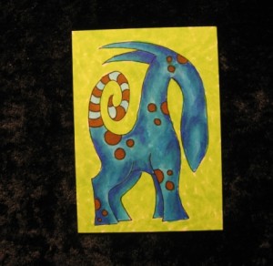
One pass of the background with lightest green, dabbing and leaving white space.

Eleven

And then a second green around the edges.

Twelve

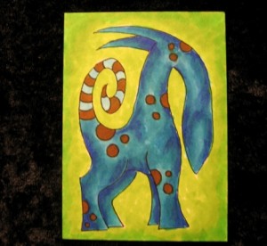
Back over with the lightest green at the sides and then covering the whole green background with yellow.  You can see where it catches the white spaces and adds a bit of texture and depth.

13, 14, 15

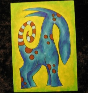
Oops, forgot to stop and take a picture or two.  I re-inked the outlines with a thicker Micron, gave him a closed eye and a nose, and added some hair after all (because he asked nicely for some).  I re-did a bit of the darkest blue, then went back over that with blue #2.

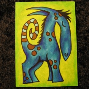
That’s it.  No particularly fancy Copic tricks.  This is a pretty basic beast with no landscape or friend or flora.  Although I started off doing lone beasts like this one, I do try to add a little something to make a bit more of a scene rather than a portrait most of the time.  Often a little dog!  But it is rough to fit multiple objects in a teeny 2.5 inch by 3.5 inch art card.