Tag Archives: Illustration Friday

IF Shades, Wombat and Chihuahua

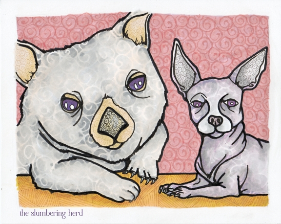
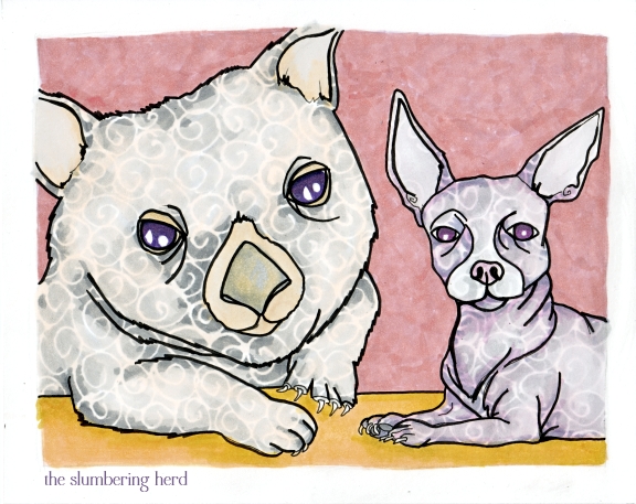
Wombat and Chihuahua Copic Ghosts

I’ve been meaning to do a wombat for ages! So my choices for Illustration Friday “shades” included – wombat with sunglasses (shades) or a wombat in front of window shades or in shades of a particular color, or a wombat ghost (shade). My first wombat is a wombat ghost! His name is Nigel. And he wouldn’t be complete if he weren’t haunting the place with his best friend Gabriel the Chihuahua (also a ghost).

Their friendship is a tale of incredible mystery and adventure, but we’ll have to save that for another time. Suffice it to say they met their untimely ends together during an escape attempt from a trio of American kidnappers in Venice sometime in 1974. They haunt the Venetian tavern where they lived with a quiet Irishman for  eight years after being won in a dice game from their former owner, a globetrotting Tasmanian.

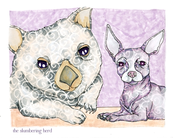
I am not sure they look entirely like shades in the final above. But how about 2 scans ago:

Wombat and Chihuahua, Somewhat More Ghostly

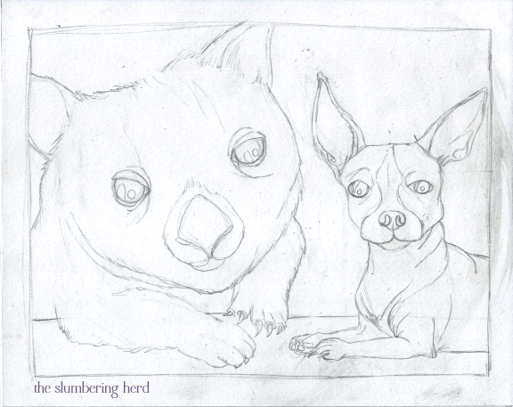
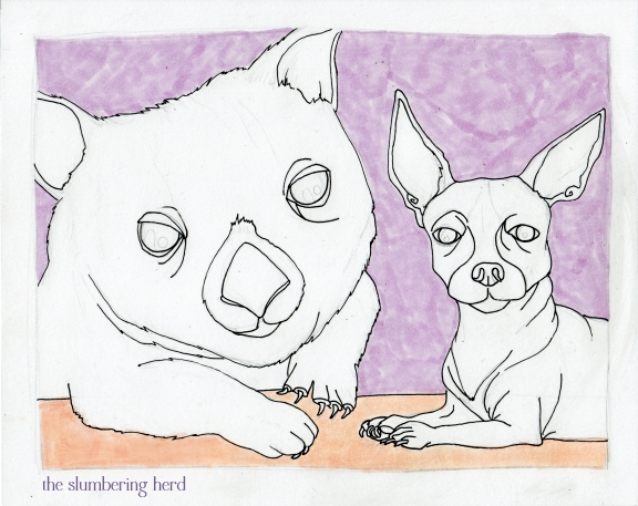
I can’t decide which I prefer. The background is definitely unfinished in this one, but I could have left the critters alone. Let me show you the whole process:

Wombat and Chihuahua Sketch

Wombat and Chihuahua Color 1

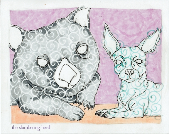
Wombat and Chihuahua Frisket

On Nigel here I went over frisket with three shades of gray then peeled off the frisket. On Gabriel you can see the Masquepen (frisket) in blue, with no marker yet.

Wombat and Chihuahua Color 2

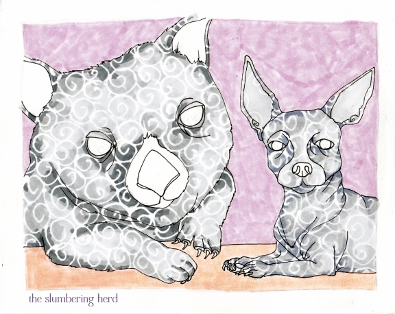
Gabriel colored with 2 grays and one gray-purple so the ghosts would not be quite the same color. I suppose I could have left the eyes white. That’s rather ghostly.

Wombat and Chihuahua, Somewhat More Ghostly

This would have been a stopping place for the figures, but the wall and tabletop need somehelp.

Wombat and Chihuahua Color 3

Wombat and Chihuahua Copic Ghosts

I don’t know, the more I look at them, the more ghostly they seem, though they did not need the extra thick black outline. I can say with certainty I have never drawn a wombat ghost, or any animal ghost, before this challenge. And though I do get a kick out of steampunk trend-wise, I don’t have much enthusiasm for the whole zombie thing. But ghosts, that’s totally different! Right? Thanks for coming!


Photo inspiration from Wombats! and Chihuahua Pictures.

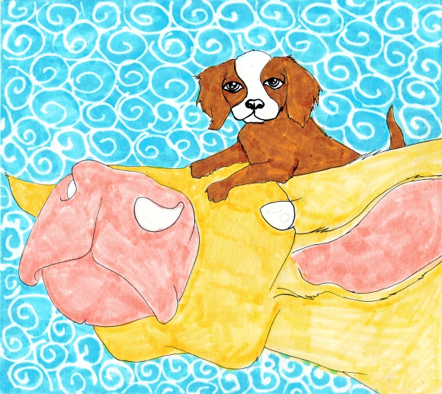
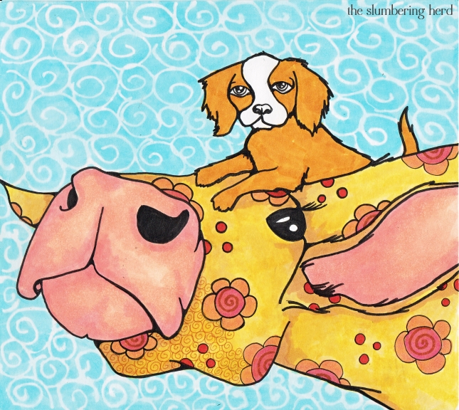
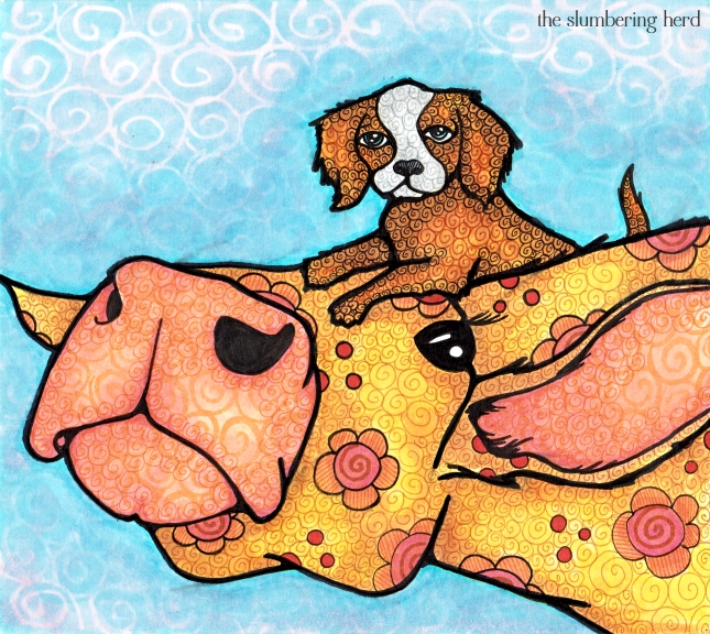
Illustration Friday, Puppy and Cow, Copics

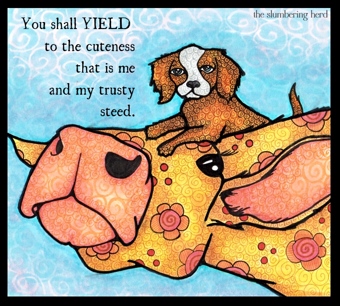
Yield for Illustration Friday, Puppy and Cow

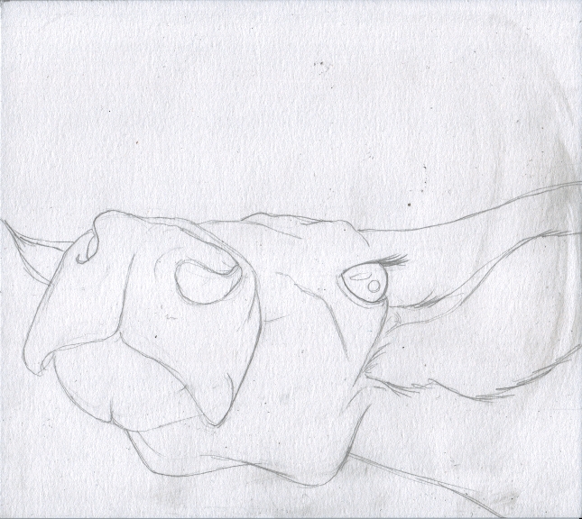
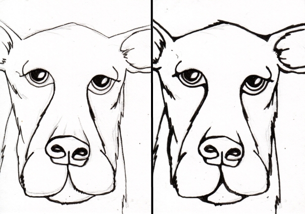
Before the new topic came out at Illustration Friday this week, I had sketched a very silly but promising cow:

Cow Sketch

I figured she made the perfect platform for something, but what? And then the topic “yield” was posted, so I thought about how I could use this cow and that word and what I came up with was to put a giant pie on her head with the words, “The apple tree produced more than double the yield of the previous year due in no small part to the fertilization efforts of Hannah the cow.”

Cow pie. Fertilizer. Yeah, not a highbrow moment. I’m ok with that. But I didn’t think a pie would be visually very interesting. I have since decided a pie would have been totally doable – but I went with cute, in the end. Which may be cheap but so is cow pie. ;)

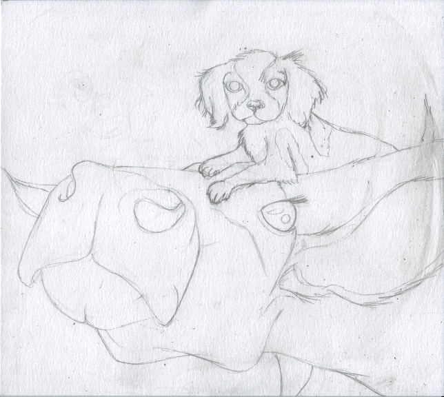
Cow and Puppy Sketch

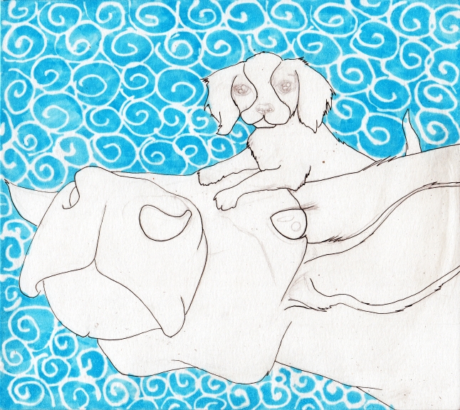
Cow and Puppy Mask

This was actually a really great blue that I lost with too many light colored coats. Alas!

Cow and Puppy Color 1

And this is the stage where I say to myself, ugh, this is not going well. But that always happens in the beginning color stages so I don’t despair quite as much as I once did. Which is good. Unless you’re one of those people who thinks inspiration is only sparked by misery. I am not.

Cow and Puppy Color 2

Cow and Puppy Color 4

I really need to finish all of the color before adding the black ink (which isn’t supposed to smudge, but does a bit!) Lots of muddy spots as a result. Probably could have done more with the background but a decent effort overall.  Thank you for coming!

Note: In case you didn’t know, I have put a detailed tutorial on how to make yourself a thumbnail for IF (or avatar or other tiny image), on my sidebar near the top of the page. I hope someone finds it useful! A thumbnail will get you more views than no thumbnail.

A Wizard’s Pantry for Illustration Friday

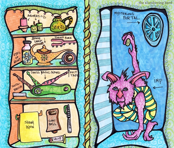
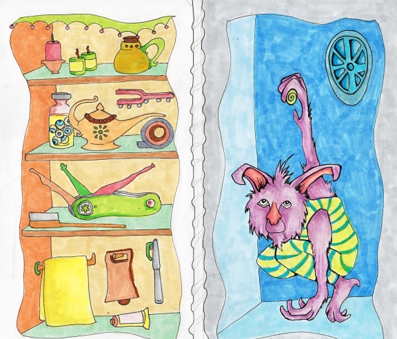
Wizard's Pantry, Copic Markers & Pens

(Apologies for having made a 9″ x 10″ item which does not quite fit on my scanner arrggh!)

“Intention” is the word this week  for Illustration Friday, and it has been my intention for a couple weeks to make a color version of my “Prepare” Illustration, which was a pencil sketch with potential. You can find that post here.

This particular color version did not live up to the promise of the sketch. I hesitate to provide a list of the problems I have with it, partly because there are so many! And partly because some of my dear visitors shall scold me for it. (I have been known to do some mild scolding of my own so it’s only fair.) Anyway, the colors and perspective and the handwriting all have problems. I’ll just leave it there.

A couple progress pics:

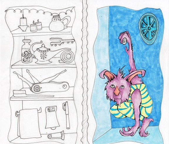
Wizard's Pantry Ink

Wizard's Pantry Color 1

I was going to add a porthole, or a window to fill all the space behind Mr. Imp but ended up with a weird thing that looks slightly like a large plastic device for hand-juicing oranges. (The wizard who was kind enough to let me draw his pantry let me know it is a portal but refused to elaborate further.)
Wizard's Pantry Color 2

I actually still like the color family at this point. But then I fooled with it too much!  Alas! Also, the imp has turned out somewhat more creepy than the cute I had imagined. I do like his crazy circus leotard, though. (It just didn’t seem right for him to stay in the buff.) I’m not sure why he likes to hang from his arm like that.

Wizard's Pantry, Copic Markers & Pens

I really love some of the Illustration Friday folks who do awesome collections of tiny, detailed things. So this was an attempt at one of those. Further attempts will be made.  Thank you so much for visiting!
Also! I have written up a (hopefully) easy and detailed tutorial for making your thumbnail for Illustration Friday (or anywhere, really).  It’s in my sidebar here! Don’t miss out on views because your thumbnail never works!

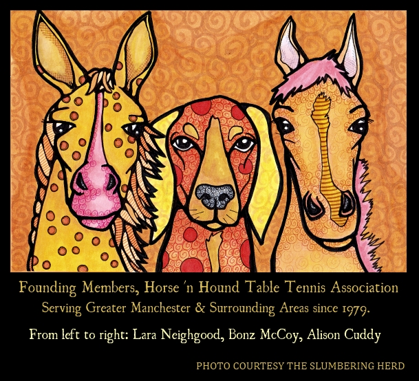
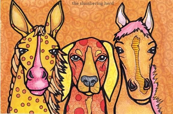
Two Horses, One Hound, Copic Markers

Horse 'n Hound Table Tennis Association

I stuck to a color family! I am very pleased with that aspect because I often try and rarely make it to the end. I mean even here, wouldn’t a pair of blue eyes or a purple background be neat? That’s the trouble with having collected half a metric ton of Copic Markers (ok hold on, I’ll check) (ok, about 115, various sizes, collected over 10 months or so).

I am once again feeling the necessity to branch out into more than headshots. However, Illustration Friday has been providing for that nicely. Oh! So my last post is heading toward 70 comments (about 8 are mine). Can I just say thank you so much to every single one and also holy cow! If I didn’t reciprocate, it is only because you did not leave your web address!

On a related note, because I was curious, I decided to count how many comments I had left so far this week for Illustration Friday. One hundred fifty-one.  Haha, is that insane or what? I doubt I will be able to keep it up, but I have been finding so MANY great art blogs. And I don’t have kids. For all you folks with a regular job AND kid(s) AND doing Illustration Friday, my hat is off to you. Seriously!

What I do is visit the IF site every day, several times a day. I know that other people don’t have the time to do this. On the other hand, I feel like I am building this wonderful, mutually supportive community. I have been able to identify a whole bunch of folks who visit regularly,and who I visit in turn. (If you are looking for folks who are more likely than the average to comment back when you’ve commented at their site, I suggest visiting the commenters from my “Capable-IF” entry just before this one – just click on their name. You will find so many great things!)

Meanwhile, back at the ranch, here is how the Horses ‘n Hound thing happened:

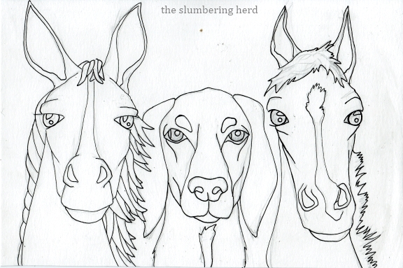
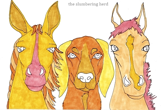
Horse n Hound Ink

Horse n Hound Color 1

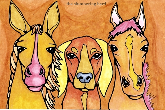
Horse n Hound Color 2

Horse n Hound Color 3

I’m thinking of starting to put together a book with some of my goofy beasts, each with a silly/weird/non sequitur type caption. (In case you wondered about the table tennis thing.) Thank you so much for coming by. You’re the greatest!

Oh! I almost forgot! I just wrote a how-to for Illustration Friday thumbnails (in my sidebar, here). If you’re someone whose thumbnail never works, give it a try.

Illustration Friday “Capable” Copic Markers

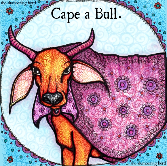
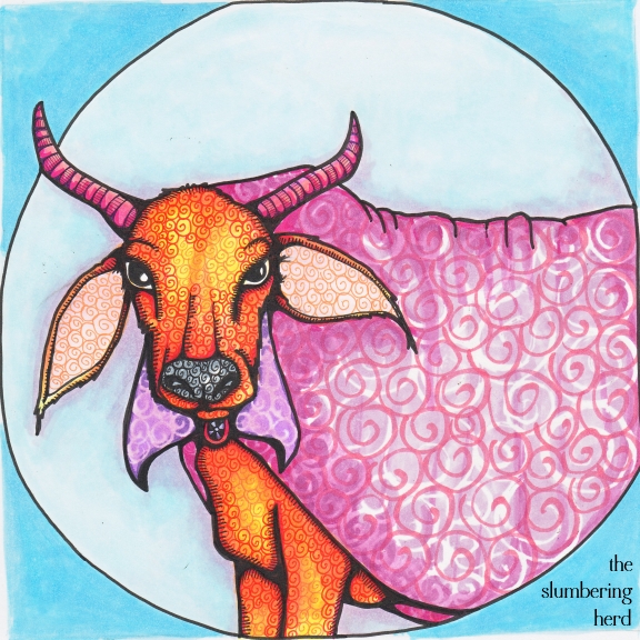
Cape a Bull With Copic Markers at The Slumbering Herd

“Capable” for Illustration Friday this week, where 104 entries have already been posted.

Yes, this entry is quite silly. I saw some other folks had gone with the cape concept, so I had to crank it up a notch! I think (again) this one is overly busy. Arggh! What I’ve been aiming for is ‘neat and intricate’, but where I have been landing is ‘overworked and confused’. But I’ll keep trying.

Here’s how it happened:

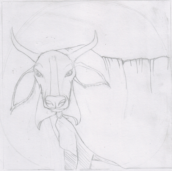
Cape a Bull Sketch

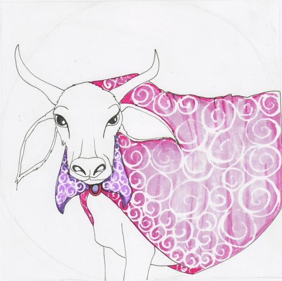
Cape a Bull Liquid Frisket, Ink 1

Cape a Bull Ink 2

Cape a Bull Ink 3

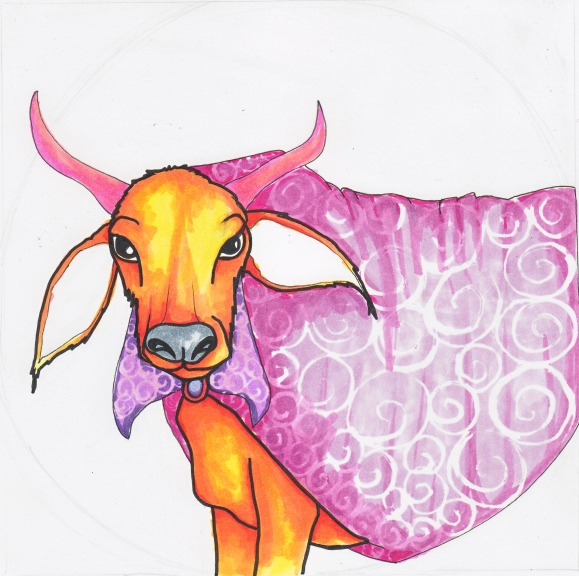
Cape a Bull With Copic Markers

A decent effort but definitely overworked. And I don’t love this color combination quite as much as I’d hoped. Next time I’d go with browns instead of blues. I’m often worried that browns are too subdued but 1. sometimes subdued is good, and 2. I really do have a lot of different browns and I generally like it when I go that way. And so ends today’s ramble!

The font is Ugly Qua. Thank you for your visit!

A Mountain of Mugs in Copics for IF’s “Fluid”

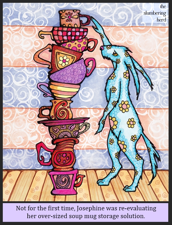
Josephine's Mountain of Soup Mugs, Copic Markers w/ Digital Frame & Text

So I recently launched an art challenge with the prompt “Catastrope” at the Etsy group Doodlers Doing Doodles. [I did not start this group (too wordy for one thing!) but as the only leader I became de facto Captain when the real one took off for destinations unknown some six months ago. If you want to join, just drop me a line!] Anyway, my idea was either a stack of dishes or a stack of monsters… or possibly a stack of dishes AND monsters. So I started a stack of coffee mugs and tea cups, and then the Illustration Friday topic “Fluid” was announced.

I believe I am stretching this topic further than I’ve personally stretched an Illustration Friday topic, to include what turned into a mountain of soup mugs. (Originally tea cups and coffee mugs but really, Josephine could hardly drink tea out of these monsters.) (Hey! It turns out I did do a stack of dishes and monsters.)

This will be my third outing with liquid frisket (the results of which are those white swirls in the wallpaper). The paper I’ve been using is Bee Paper Company’s Artist Marker Pad, recommended for use with Copic markers. It is insanely smooth and very nice for markers, but it’s only 110 lb. so the frisket buckles it a bit. That is part of the reason these particular swirls are much larger than my normal. Here’s how it all began:

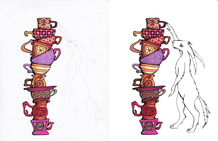
Mugs and Rabbit wip 1, 2

I figured some sort of creature imminently at risk of toppling the stack was necessary for a looming sense of “catastrophe”. I also used color before black multiliner to cut down on smudging.

Mugs and Rabbit wip 3, 4

I thought about leaving it here, with just the outline of the rabbit beast. Many Illustration Friday folks employ two different techniques in one drawing or painting and it is usually a pretty neat effect. Perhaps I should have done a background but left the bunny as she is here. Actually, if I did it over again that’s what I would do.

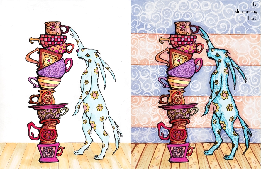
Mugs and Rabbit wip 5,6

I think the background is too busy. Or I just don’t know how to make the foreground pop out. I suppose I could put an otherworldy glow around the objects but will have to look into additional methods. (Do you have one? Please let me know. Yet another item I would have learned in art school. Alas!) Oh! And one more fyi, because it seems like good info: the font in the final at the top is Cambria Math.

Thanks so much for stopping by!

That’s One Popular Sheep Cart

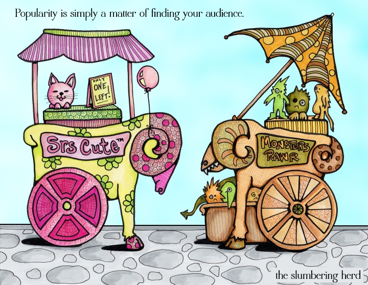
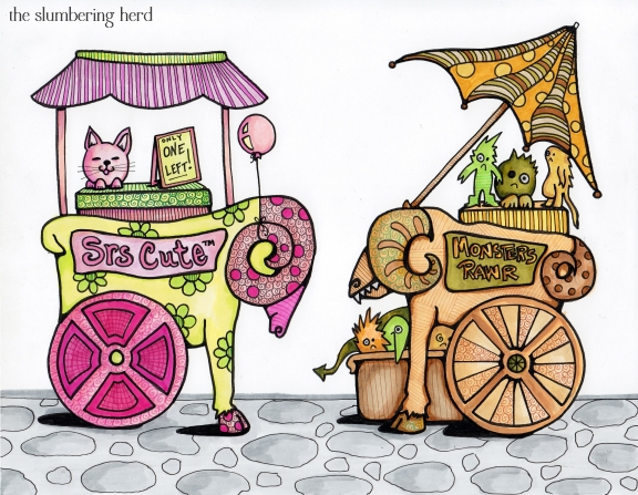
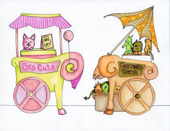
The Most Popular Sheep Cart, Copic Markers with Digital Sky

This week’s Illustration Friday topic: “Popularity”. I really had no idea what to draw, for a while, and then I decided that two competing little kiosks might be nice, with competing salespeople. And maybe the popularity of one had to do with the pretty girl running it, and for the other, the quality of the product. But sheesh, that’s a lot to get into a single frame. At least for me who hasn’t done a lot of narrative drawings.

I started to draw the kiosks, but that was more complicated than necessary and I switched to little sales carts.

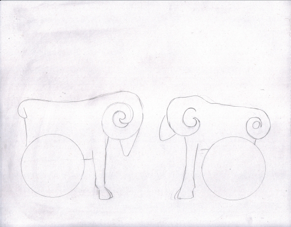
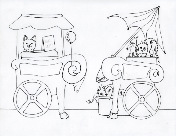
Toy Carts Initial Sketch

Rather than plain little carts, of course I figured they should in the shape of animals. Goats or sheep, perhaps. As I drew them I decided they would be very different kinds of carts, and one would be more popular than the other.  I picked toys because a little anime style cat could be seriously cute and I was thinking zombies for the other cart but went with misfit monsters.

Toy Carts Inked

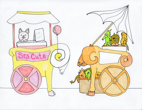
I wanted to add more things, but I was worried about clutter. So, no little sales tags, no “50% Discount Sale” sign for the monster cart and no salespeople. Not even any customers! So I tried to figure out a slogan or saying that would tell the story I was trying to tell.

Toy Carts Color 1

Toy Carts Color 2

Sheep Carts Original Drawing 8.5" x 11"

The Most Popular Sheep Cart, Copics w/ Digital Sky

Thank you as always for coming by and thanks to everyone for the kind and excellent comments.

Which reminds me!  A very kind and hilarious person at Moonsword’s Chamber has done a little write-up about my shop. He showcases a lot of different artists and I found some really cool ones there, so take a gander if you have a moment!


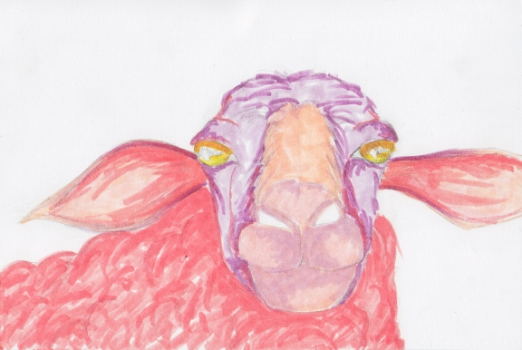
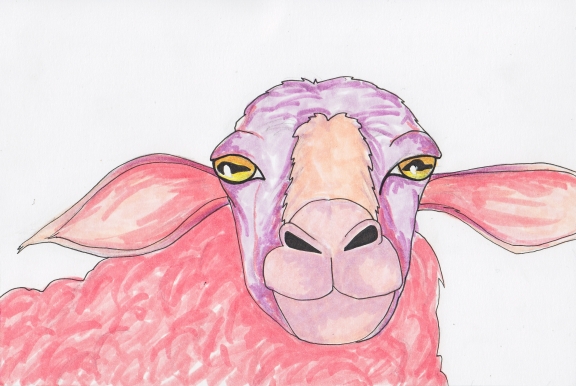
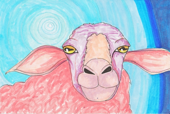
Illustration Friday “Suspense” – A Copic Sheep

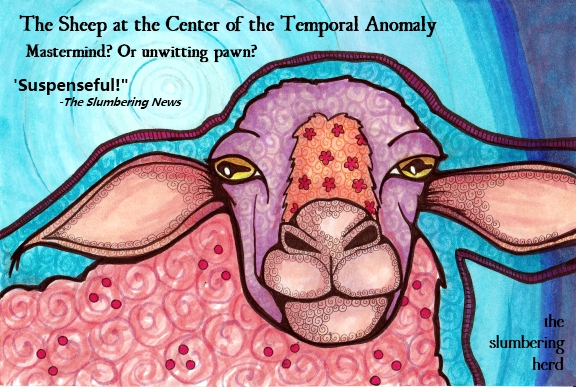
Suspense Sheep Poster, Copic Markers with Digital Text

This week at Illustration Friday: Suspense.

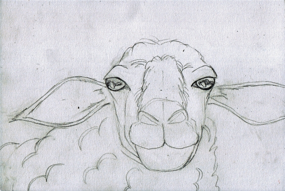
I was intent on using a sheep in a suspenseful setting. But what? First, I drew the sheep. I added one curled lip with a fang underneath! Vampire sheep! No, no, the vampire thing is so 2000’s. Then I thought, wall of flames! But no, flame colors would be too close to the sheep’s color. Then I thought, black hole! And I sort of went with black hole, but I decided on blue and the resulting effect was much more reminiscent of a temporal anomaly than a black hole. Which works for me. (Is “temporal anomaly any kind of thing outside of Star Trek? … Didn’t think so.)

Suspense Sheep Sketch

Suspense Sheep Color 1

I did something different here. Instead of an initial ink, I just left the pencil and blocked in some colors. One of my recurring problems is smearing the black ink, so I was trying to avoid that. It looks rather dreadful in this state, however. Scrap it? No way!

Suspense Sheep Ink 1

A basic outline in 0.1 Copic multiliner helps a great deal.

Suspense Sheep Color 2

The temporal anomaly. I kind of like the way the center of the anomaly is looking in this one, I probably shouldn’t have messed with it. Also, the dark blue/purple at the far right is rather a disaster and I left it looking far too markery but I left it for now. At this point I knew what the title would be.

Suspense Sheep 6" x 9" Poster, Copic Markers with Digital Text

I figured I still needed to work in the “Suspense” thing a bit more, decided to include the title on the drawing, and went with another poster type product like I did with my stalking cat in the “Forward” challenge. (UglyQua is the font again.) Adding the text element is fun and I predict this won’t be the last!

9:00 Saturday evening in Chicagoland, and 141 entries already posted. Thank you so much for dropping by mine!


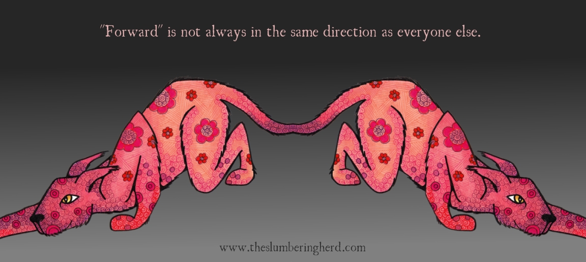
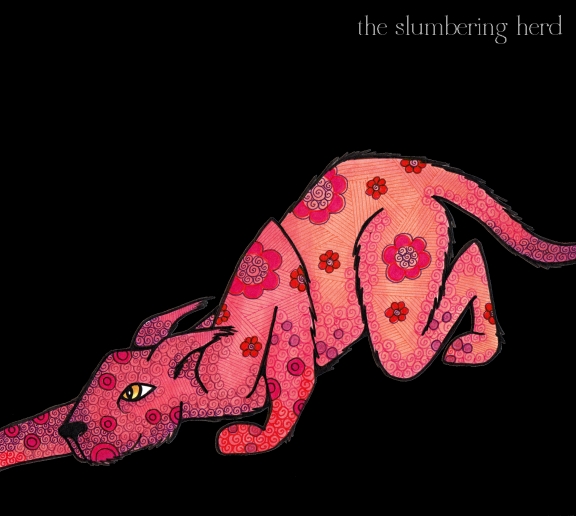
Illustration Friday “Forward” & Pink Cat Beasts

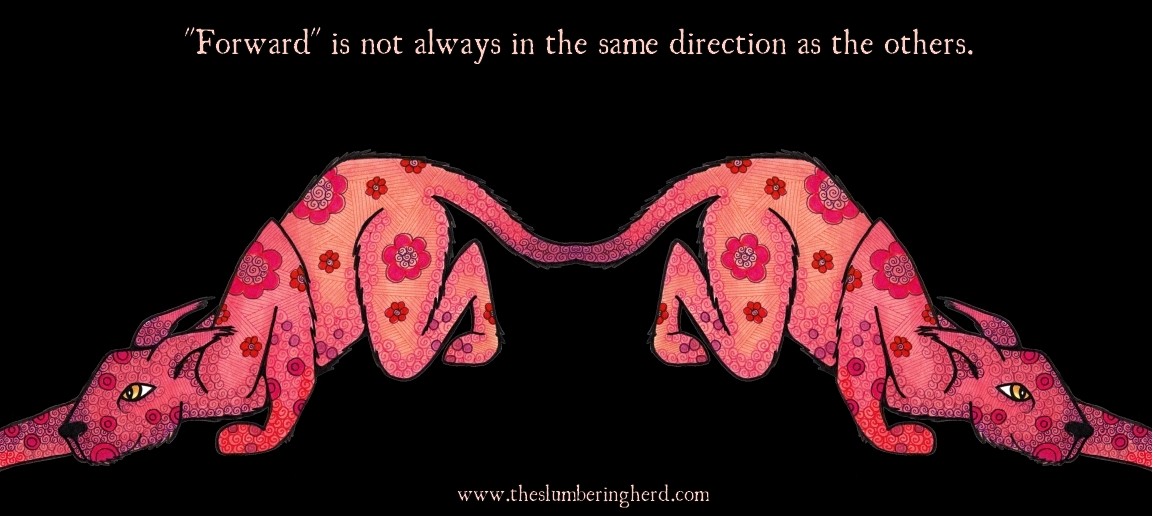
Forward Isn't Always

I posted this last night but kept thinking the black background was too severe. This morning I made version 2 (with slightly different wording):

Forward Isn't Always, v. 2

I had been meaning to do both cats and whole animal bodies for a change. I was a bit stumped by “forward” at Illustration Friday, but finally figured a stalking cat would be a good challenge. I had trouble with it! In fact, I almost scrapped it at several points.

In the end, I am sort of pleased with this poster-type slogan thing I came up with. The quote went through a lot of re-writes before I settled on this one. (Another option would be about trying to go in too many directions at once.) (Also I’m not positive about the grammar! But I don’t mind.) The font is UglyQua, which reminds me a bit of the font Edward Gorey often used. It might also be overused but I am not a font expert so I don’t know and I certainly hope it doesn’t offend any snotty super nice design people.  (click on image for a better look!)

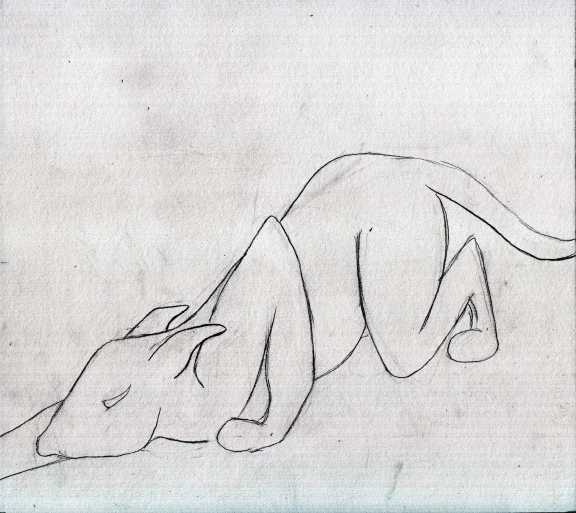
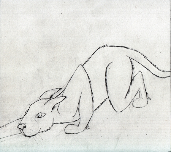
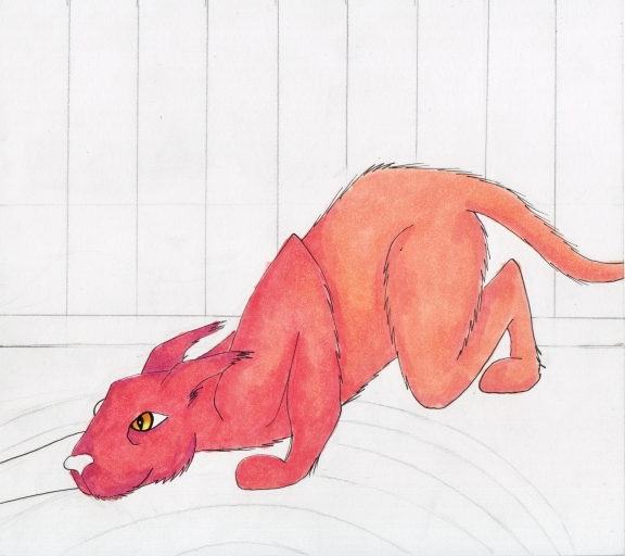
I didn’t set out to do a double cat beast, but I was not happy with the original background so had to change my plans mid-flight (which often leads to better places). I was going to do a striped wallpaper wall and an oval rug beneath the (single) cat beast. When that didn’t work, I pulled the cat beast out of the page with Paint.NET, made a double by flipping him, and added the background and text digitally. Not 100% happy with the patterns on him but I was experimenting and that doesn’t always work out! Some progress pics:

Stalking Cat Beast Sketch 1

Stalking Cat Beast Sketch 2

Stalking Cat Beast Copic Color 1

Stalking Pink Cat Beast, Copics with Digital Background

Further Dog Adventures, ACEO Style

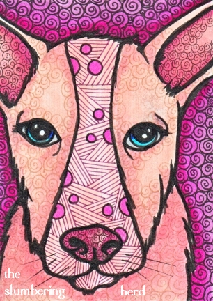
ACEO Dog Emma, Copics

I was going to do something much more twirl-related for this week’s Illustration Friday, since that is the topic. But I am currently in the midst of rather severe ACEO dog fever and I didn’t want to stall the momentum. It all started two posts back because I decided, after several days without much inspiration, to draw a sad ACEO dog. One dog led to a four-pack of hound dogs which then led us here. (The current pack has standing ears. They may be hounds but more likely awesome mixed-breed rescue types with mysterious ancestry.)

In any case, I have completed Emma (above) in my recently typical fashion, with lots of swirls. Though this is not technically the same thing as “twirls”, I hope I won’t be judged too harshly for stretching the topic somewhat, from twirl to swirl.

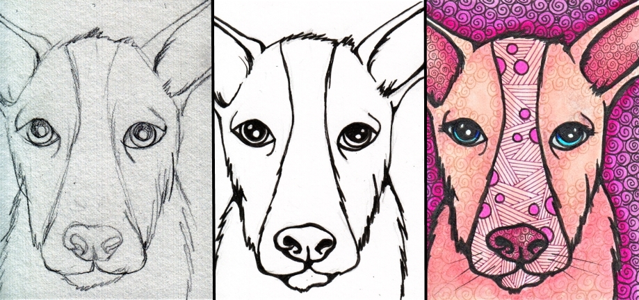
Emma in progress:

ACEO Dog Emma: Sketch, Ink, Copic Pen/Marker

The other members of the new pack, as yet inked only:

ACEO Dog Rufus, In Progress

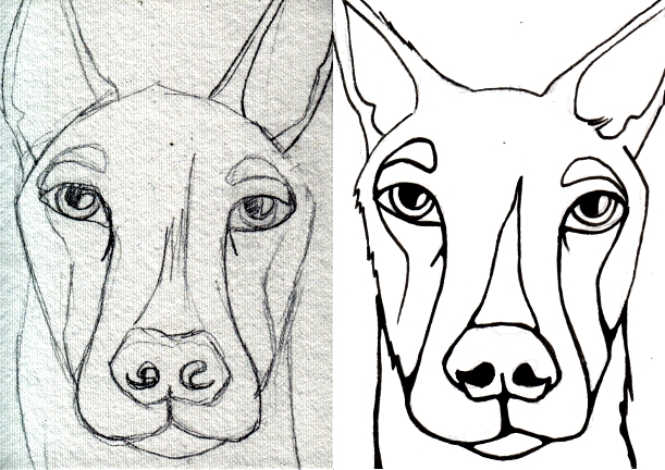
ACEO Dog Bear, In Progress

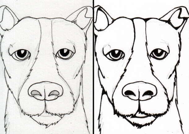
ACEO Dog Ernie, In Progress

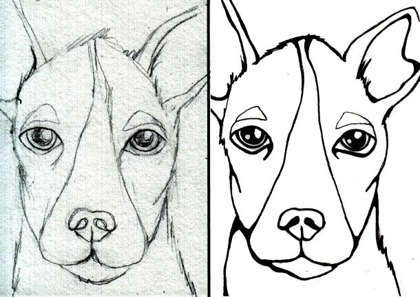
ACEO Dog Annabelle, In Progress

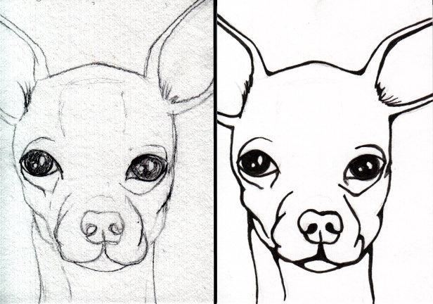
ACEO Dog Millie, in Progress

All six goofy and and generally charming ACEO dogs drawn by hand in pencil. Then, Copic multiliners, mainly size 0.1 and 0.3, though Emma got filled out with a 0.8 and that was probably a tad too wide for 2.5″ x 3.5″. I’ve been using pre-cut, ACEO-sized smooth illustration board, which comes in handy 5-packs by Strathmore (about $2/pack at Dick Blick’s). I hope to post the colored-up versions soon.  Thanks for visiting! Dogs rule!