Steampunk Collie in Copic Markers, Progress Pics

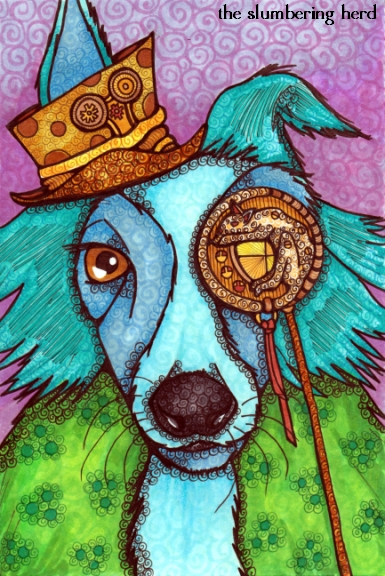
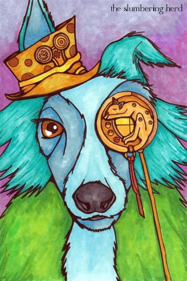
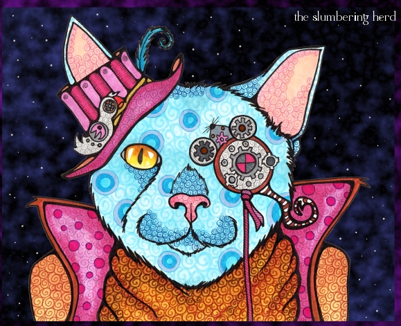
Steampunk Collie 9x6


Ugh, midnight and I must work early tomorrow and then board a plane for Florida. (Much cheaper tickets the week after a holiday.) But I’ve been meaning to finish this beast for days. Usually I start and finish one of these 8x10s or 9x6s in one night, or occasionally, two. So this one sitting for five or six days was an anomaly. And dammit I’m staying up to finish this post.

I fear he’s been a bit overworked. By the pen, not by his boss or something. I don’t know if he has a boss. Frankly, he’s been rather mysterious about his past. The only thing he will say for certain is that he is certainly NOT a collie. As you can see, these protestations have not led to my changing the title of this illustration or this post. And sure, he’s not a classic Lassie collie.

He’s also slightly standoffish, so I’m not actually sure if he’s wearing a fuzzy green coat, or that’s his actual dog coat. Although… it’s probably not fair to call him standoffish.  Deep in thought is much more likely. Inventor-types so often are.

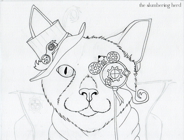
I finally broke out a white gel pen I had picked up, but I really don’t know anything about how to best use it. I did some swirls on the cat part of the eyepiece (then went back over them in black because I didn’t love the look of it), and put a few swipes on his nostrils. (The eye is not gel pen, it was just not colored.) Anyway, progress pics!

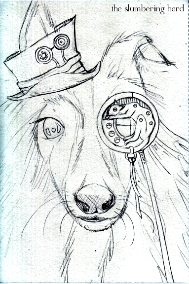
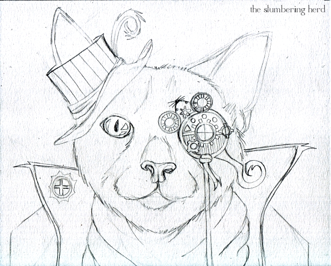
Steampunk Collie Sketch

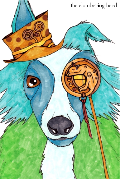
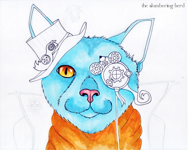
Steampunk Collie Color 1

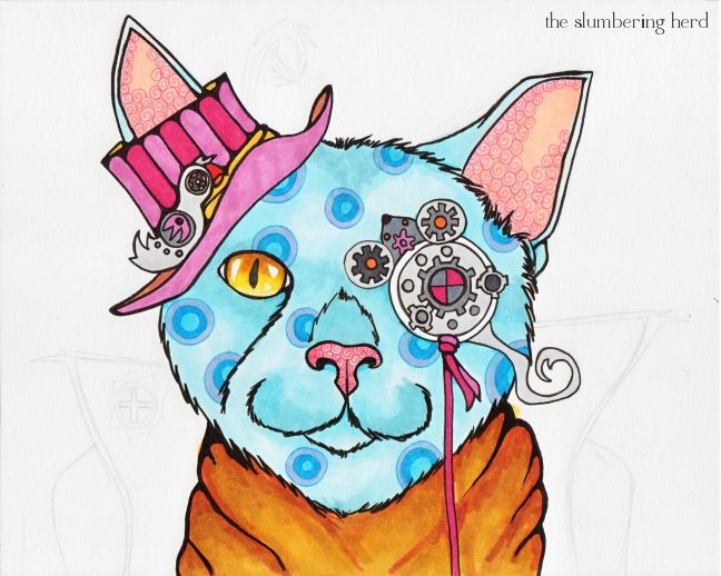
Steampunk Collie Color 2

Steampunk Collie 9x6

Some combination of the second to last version and the final version would have been preferable, I think. I like some of the effects that were added, but it is too busy and I should have stopped sooner.

Overall I like him and despite the enormous number of outstanding dog/animal artists on Etsy, I must do more dog beasts. They are, if not the best kind of beast, then at least in the top 5% of beasts. Amirite? Thank you so much for dropping in!

Copic Carriage for IF “Round”, with Progress Pics

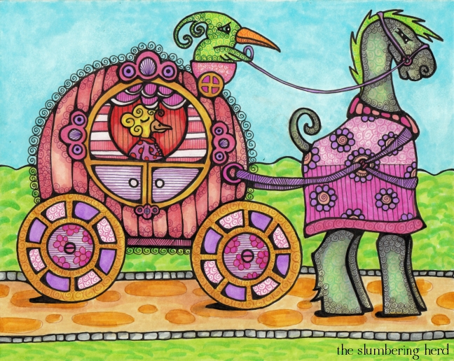
Carriage in the Round with Copic Markers


It’s Illustration Friday again! 100 people have already posted since this morning. I’m not sure why there’s a mad rush at the beginning of the day, but I imagine some people think the same of me, as I have been posting Friday night or Saturday. I do have a full-time job but no kids, so that’s one thing. Well, I suppose in my defense I am very enthusiastic about the whole thing. I like to do something new and post it when I’m done and then go visit lots of others.

I also believe everyone should visit at least a few! But I am not in charge. And I do appreciate the people in charge because IF is pretty cool.

So this carriage illustration is not my favorite thing I have done. In the first place, can you see the worried expression on the poor driver?  He’s waiting for his brother to return with a harness that fits. I mean really, if the poor courser took a step his back ankles would smack the wheels. He’s not even standing in front of the carriage, but off to the side. Also, I need to look into ways to make ground shadows that are not as terrible as these! And now, (dramatic interlude)… progress pics!

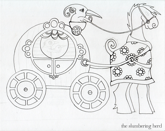
Round Carriage Ink

I’ll be honest. I almost started over right here. Lots of “round” but not much life! The horse beast’s body is actually quite round but it looked goofy so I covered it with a decorative coat! (With the added benefit of no chafing! Also the coat ended up being one of my favorite parts.) But even when I don’t love a sketch, I want to see if I can make something out of it.

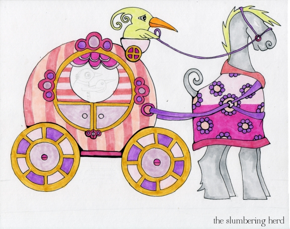
Round Carriage Color 1

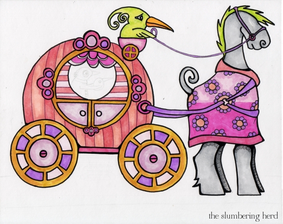
Round Carriage Color 2

Carriage in the Round with Copic Markers 8 x10

Now that I look at it, I think the back wheel should be the one further set from the carriage. Ah, I should have looked up carriage fabrication. Alas! I fear the background is rather uninteresting, but I was afraid trees or buildings would make it too busy.  Must work on these things!

Thanks for stopping in!


Steampunk Magician Cat with Copics, and a Question About Art Bias


Magician Steampunk Cat


Hello! More Copics! Let’s face it – even if I was totally sick of them, an eventuality I do not predict, they cost too much to set aside.  Which is kind of funny and kind of rough. But that does lead to a question I have been asking myself lately, and that is, how much more is painting respected as an art form, than marker art? I think quite a lot, and that makes me feel like I should “eventually” be a painter.

I mean, I believe pen & ink art is a longstanding and respected art, but I still think people have a bias toward traditional painting. And markers to me seems even a step down from pen & ink. I mean, I think markers in the same way I think “crayons”, a bit. So if I have this bias, so must other people? Most people? What do you think? (I don’t know if the bias exists in regard to digital art, but I suspect in many circles it does, though less so than markers, I imagine!)

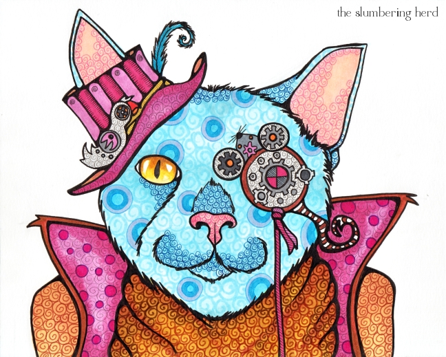
Ok, here’s some progress pics. I had planned on a steampunk cat. But steampunk cat turned into steampunk magician cat. I think it’s the big cape thing. Also his ability to shoot lasers from his claws. I was pretty pleased with the mouse-shaped eyepiece (with tail that can be used as a bottle opener!). I actually just started a dog (collie-ish) with an eyepiece in the shape of a cat.

Steampunk Cat sketch


Steampunk Cat ink

Steampunk Cat Color 1

Are those some crazy blues or what? Copics. Yup.

Steampunk Cat Color 2

Magician Steampunk Cat, 8 x 10 with Copics

Magician Steampunk Cat, Copics with Digital Background

I thought this cat would make a perfect Saturnalia or other holiday card, which it does! And can be found in my Etsy Shop. (I also have prints on order!)

Thanks for stopping in! Let me know what you think about that markers vs. painting thing.

Illustration Friday’s Vanity (sort of!) with Progress Pics

Whimsical Vanity in Copics


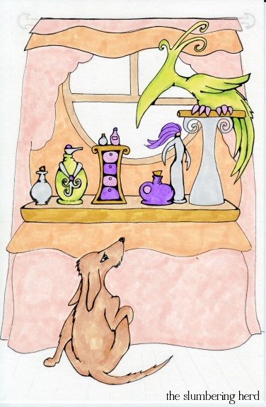
This week’s Illustration Friday prompt was “Vanity”. The boyfriend suggested I do the Vanity from Prince’s band. This did not interest me for many reasons, primarily my reluctance to do people at all, let alone likenesses of actual people. So I settled on an illustration of a vanity table, despite “vanity” being an excellent opportunity for a little visual social commentary. But there would be creatures, of course! I don’t believe this blog has one drawing without at least one creature. It is The Slumbering Herd, after all, not The Slumbering Inanimate Objects. :o)

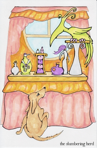
So, that window was originally a mirror – this being a vanity, and all.  But I just couldn’t get it to work out.  I had the bird looking into the mirror but uh, yeah, no. I hope nobody minds that I took some liberties with this vanity in that its owner was sick of the mirror and preferred looking out onto lovely sky.  As for the bench one might normally find at such a table, in fact it has a beautiful brocade orange bench, but the dog pushed it out of the way in order to sit and watch the bird (his favorite thing to watch in all the world).

So let’s see how many entries have been posted in this day and a half since the prompt came out! 136 and counting.  Sheesh. I’ve taken to commenting primarily on those entries that fall into the “children’s art” category, and sometimes I miss some. So many great artists and blogs!

This week I also ended up at the Artists in Blogland Show and Tell Saturday, so I’m going to link there, too! Welcome to my place, wherever you came from! If you care to comment, leave your address in the form thingie so I can visit back.  And now some progress pics:


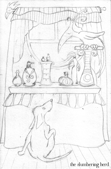
Vanity Sketch

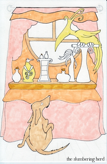
Vanity Color 1

Vanity Color 2

Vanity Color 3


9″ x 6″ with Copic markers and pens on 150 lb. drawing paper. Thanks for dropping in! (Also, arrrrgh, working on some formatting issues.)

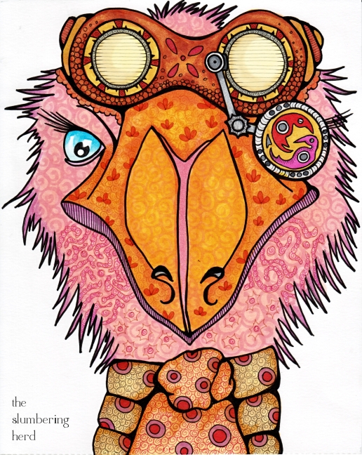
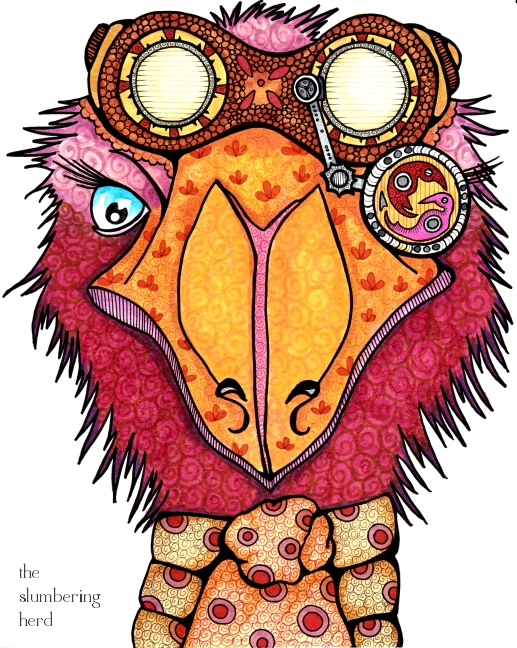
Wild-Eyed Steampunk Aviator Emu with Copics


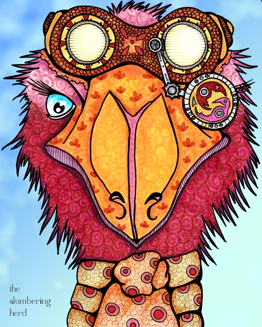
Steampunk Aviator Emu


I had a crisis during the production of this beast! If you’re only interested in the end result, look no further than this first, completed image.

He is known as Pippin Blue Eyes.  Yes, named for a particularly mischievous hobbit. Yes, I put a Tolkien reference on my blog.  So sorry. (Alternatively, you’re welcome!)

Pippin has a quick temper but it rarely escalates beyond (what he thinks are) proper British exclamations such as  Bugger it!, Absolute rubbish!, and Flibberty Gidget! So he’s really both mild-mannered and cranky, a bit like a Caractacus Potts.

And since Caractacus Potts came up in another description recently, I must have Chitty Chitty Bang Bang on the brain. Which I do.  And the reason I do is that I stumbled upon the blog of German artist Iris Luckhaus through Illustration Friday, and after an exchange about Mary Poppins I mentioned the aformentioned, and she had never seen it!  And was excited to see it!  I hope to hear from her, actually, once she’s seen it. (Tschitti Tschitti Bäng Bäng, if you wondered.)

Holy cow, can I ramble. I promised you a crisis:


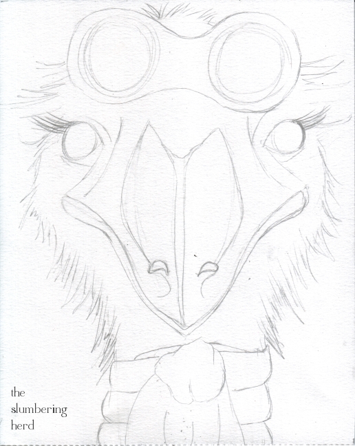
Aviator Emu Sketch

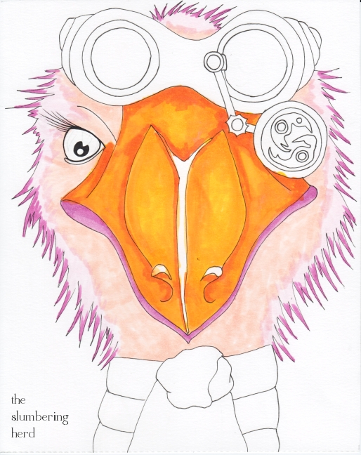
Aviator Emu Color 1

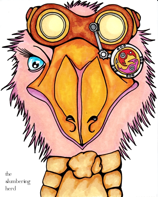
Aviator Emu Color 2

Aviator Emu, Disaster!


Though I don’t recommend it, you are welcome to click on that 4th scan, the disaster. His cheeks, see, were accidentally covered with two very bad and ugly patterns. Then I tried to fix it but made it worse. <dramatic music>  And I almost abandoned poor Pip right then and there! Then I decided to try and cover it, because Copics do tend to cover well with darker colors over lighter ones.  I worried about the fine liners I had used!

But I believe I was, in fact, saved by RV17 – Deep Magenta (after two slightly lighter colors failed in the same pursuit). Crisis averted! I added the sky digitally and the next day, I came here to tell you about it.

Steampunk Aviator Emu

Steampunk Aviator Emu


Steampunk Aviator Emu Pippin is an 8″ x 10″ original illustration with copic pens and markers on 150 lb. smooth drawing paper. Thank you for coming! I’m so sorry we were out of pumpkin bread and tea. Maybe next time?

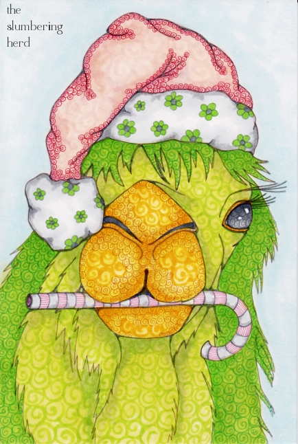
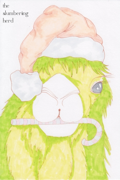
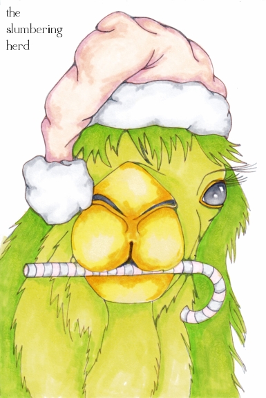
Holiday Camel with Progress Pics

Holiday Camel in Subdued Copics

This week’s Illustration Friday topic is “Silent”. I had a hard time deciding what to do! I considered a reading room, or someone reading a book. Or people with hands over their mouths. Then I decided I would silence my color palette! Now ok, I didn’t really silence it. But this is extremely subdued for me.  Really! Just look to the right at all those teeny bright-colored thumbnails.

I decided I wouldn’t even use black ink. I started out using sepia but it wasn’t quite working for my purpose so I switched to gray. I just happened to have picked up a gray .03 fine liner, and that is responsible for all the lines in my Holiday Camel. Maybe, being green, she’s a Holiday Elf Camel! (Did you notice how I cleverly covered her right eye with the poofy hat thing so I wouldn’t have to worry about lining up/matching the eyes? I wasn’t planning to do that, but 1. I do like the flopped-over-the-front hat look, and 2. I was struggling a bit with the eyes.)

She is also, I must say, an extremely talkative green (elf) camel. Lately it’s all about Nathan Fillion.  Goodness, you never saw a camel so in love with Nathan Fillion. Anyway, in giving her the candy cane I have indeed silenced her for a time. (She loves candy canes so don’t think I was being mean.)

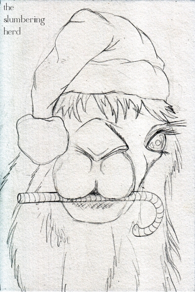
Anyway!  So ends this week’s convoluted defense about this beast being a fine candidate for the “Silent” topic. And now, some progress pics!  Since she is tall (9″ x 6″), I am going to attempt a horizontal gallery of progress pics.

Camel Sketch

Green Camel Color 1

Green Camel Color 2


Thanks so much for stopping in! (A note: I have been getting loads of wonderful comments, but sometimes they do not include a web address. Please include your address! I like to go visiting.)

Beast Town Hotel, Copics & Progress Pics

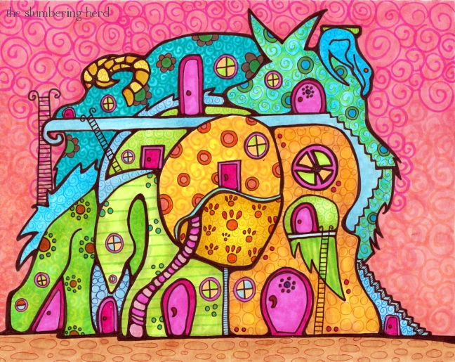
Beast Town Hotel

Serious colors, right?  Copic markers. I have asked if they have any positions open.  I mean, more than one person has suggested I sell their products on my site!  I tell you something, it’s pretty cool to be a fan of a brand that is cool and makes a cool thing. Because there are so many brands that are not cool and make absolute crap (and ruin the planet and ruin people). Ugh, don’t get me started.  On to the progress pics!
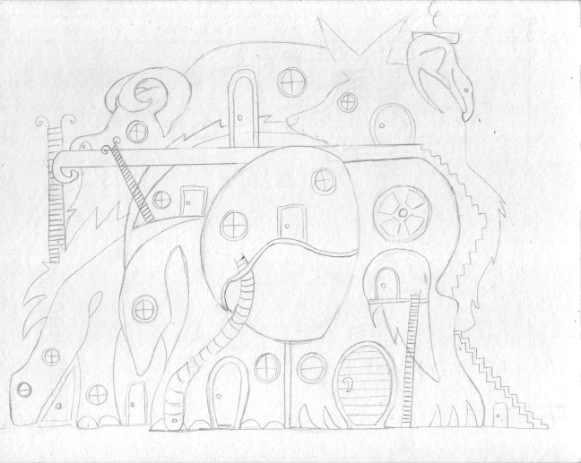
Beast Town Sketch

So for the latest Doodlers Doing Doodles challenge, we used my prompt suggestion “Fantasy Cityscape or Skyline.”  I really love cool brightly colored art with lots of whimsical buildings, whether a small town or big city.  And I would like to be able to do scenery like that.  However, usually I do animals.  Well, I still did animals. But also buildings!
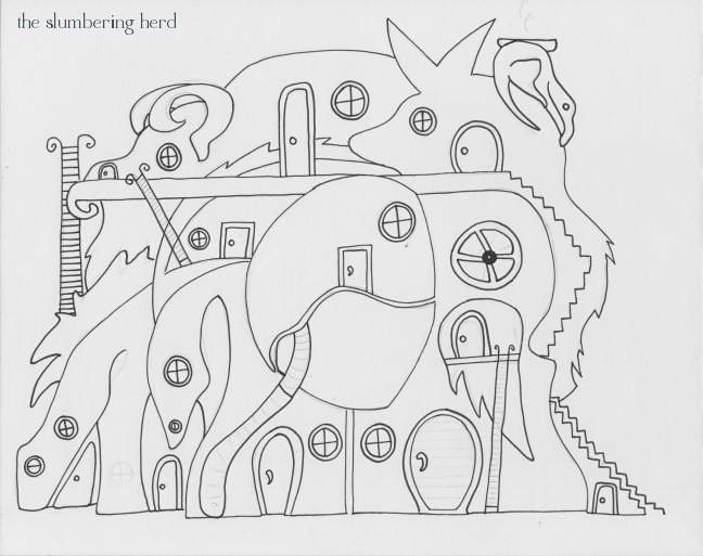
Beast Town Ink

As you can see I originally had a bit of smoke coming out of the chimney.  I wish I’d left that, because I’m not sure it’s clear that it’s a chimney. Though this post is called Beast Town Hotel, it was originally supposed to be a town (a townscape).
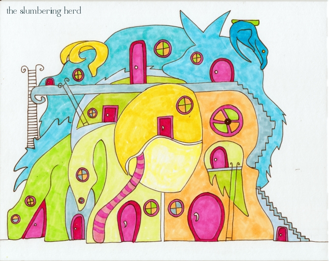
Beast Town Color 1

Here is just one coat of one color for each item. I was originally going to stick to blues and greens.  And then added yellow.  Then I thought the doors should be bright pink – and I really like how pink and orange look together.  Well.  You can see the green/blue plan was somewhat overrun.

Beast Town Color 2

I included this one to show the kind of very rough shading I use as a base for whatever details will come on top.  I realized through trial and error that this is how to get those lovely glowy spots. (You painter people probably know this, but we all come to wisdom in our own good time [one hopes]!)
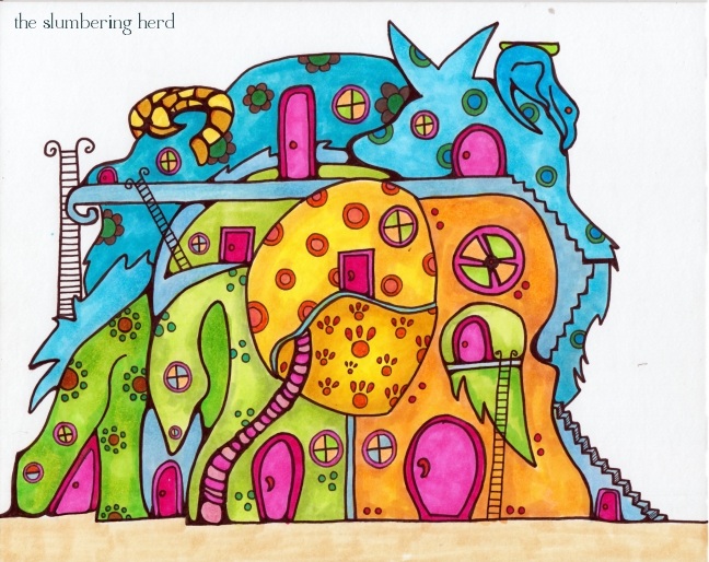
Beast Town Color 3

For the larger patterns before the swirls I wanted a variety, but nothing that would overwhelm the doors.

Beast Town Hotel

I’m pretty happy with this (particularly the colors), but I am running into limitations with my biggest regular nib pen, the 0.8.  I should probably use a brush with ink for thick outlines (that I prefer not to be a uniform width), but that would require learning another new thing. One of these days, perhaps!

I would offer a free night at the Beast Town Hotel, but they are booked way into 2026.  And actually, only a few rooms are hotel rooms.  Several doors lead to spacious apartments with permanent residents. However, you are always welcome to visit and have a meal at the restaurant. It’s difficult to describe the food in humans terms, but it is most like the noodle cuisines of Thailand and Vietnam. If you do happen to stop by, you will be charmed by the variety of cute and funny beasts that frequent the bar and indoor swimming facilities.

Thank you so much for dropping in!

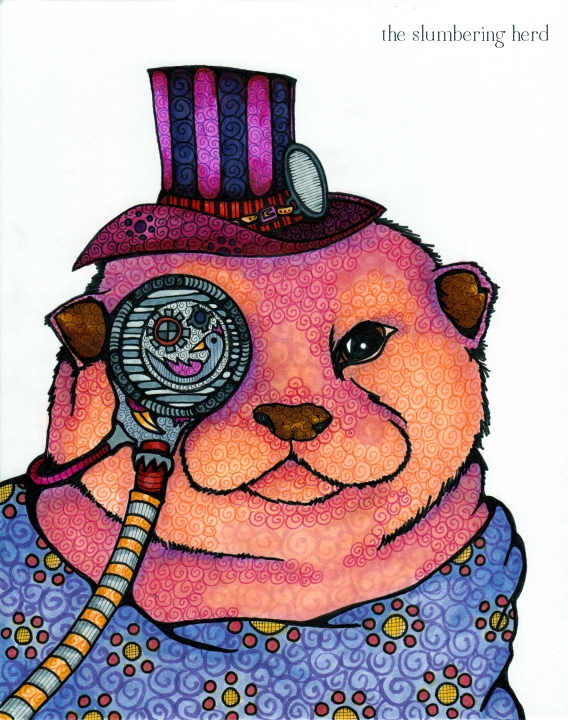
Steampunk Otter, Copic Markers, with Progress Pics

Steampunk Otter with Copics

I believe I like this fellow. But of course I will tell you the problems I see!

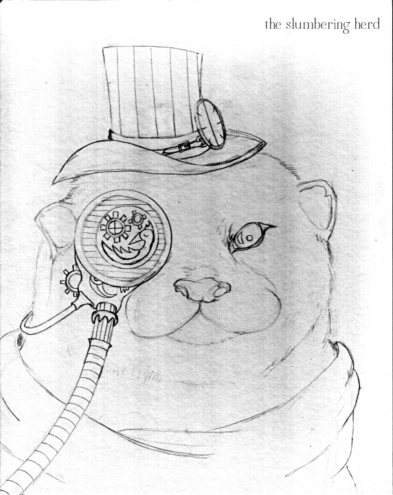
Steampunk Otter Sketch

The sketch.  Unlike the last rodent, a ferret, this one actually looks like an otter.  Also, a ferret. Or mongoose, or mink or muskrat?  Actually, what does a muskrat look like? Ah ha! A muskrat looks like a beaver.  So, I don’t think this sketch looks like a muskrat.

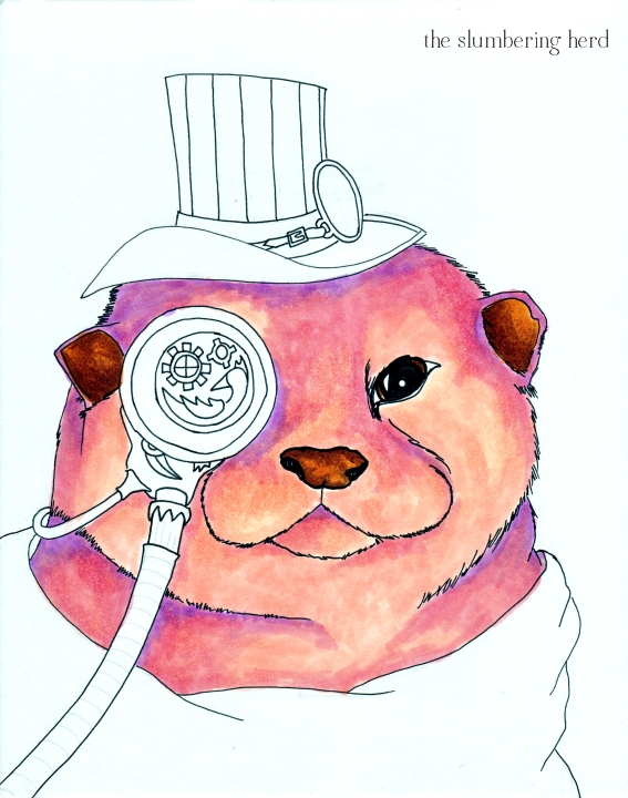
Steampunk Otter Color 1

I had decided on pink/peach because so far most of the steampunk beasts have been blue or green. And I have so many shades of pink and peach and purple markers that it had to be done.  The ear on the left does not look right, alas.

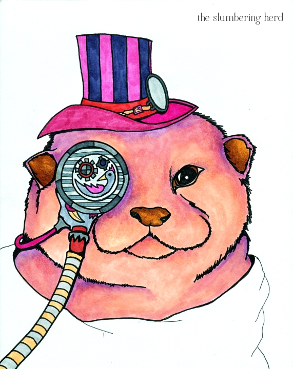
Steampunk Otter Color 2

So once you decide on a beast’s color, you have to then decide on accessory colors. Looking back I should have gone with green and purple, or maybe just greens, but I like the idea of limiting the color palette (something many folks doing Illustration Friday challenges do quite well!)

Steampunk Otter with Copics

I like the furry feel of the swirl. Not sure about the scarf/giant ascot/blanket thingie. But I like this one better than the anteater. Look at the glowy purple through the top of his hat!  Go go, Copic Markers!

Thank you for dropping in! Drop a note so I can go visit your place. ;)
Stripe and Bustle for IF Friday with Progress Pics

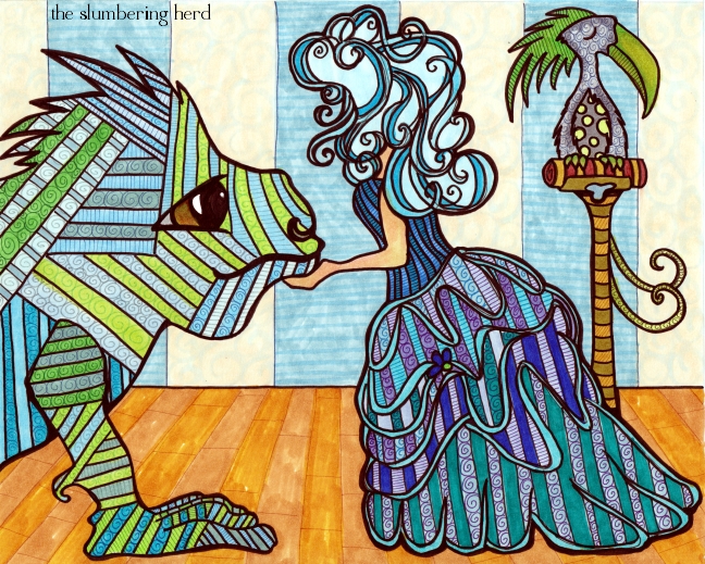
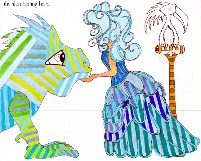
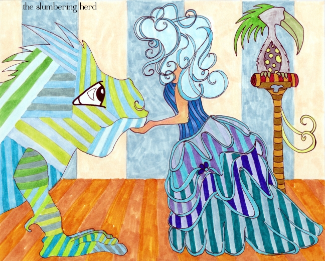
Stripe and Bustle

Busy, stripey, slightly mysterious thing for the Illustration Friday topic “Stripes”.  I have wanted to do a bustle for ages but was afraid.  Pfft, was not very hard and I am quite happy with it.  Still avoiding faces though, which led to a cool and successful hairdo. The stripey beast is rather flat, which was the original intention, but it doesn’t seem to go with the rest. Also, did a pretty bad job on his eye.  Arrrgh! Progress photos below.

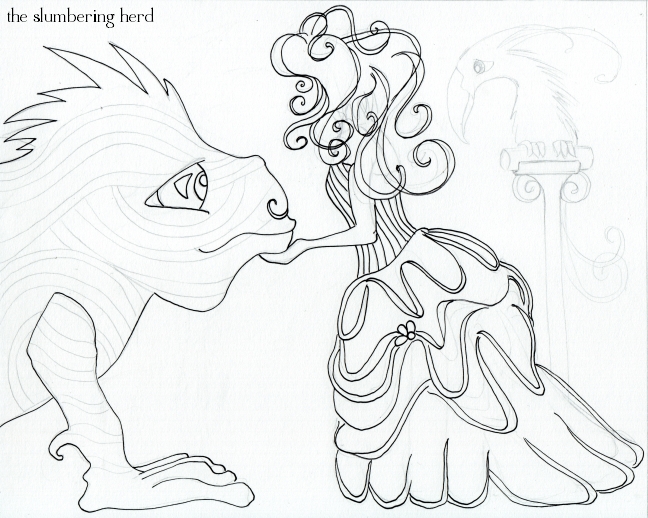
Stripe and Bustle Sketched

Stripe and Bustle Color 1

Stripe and Bustle Color 2

Stripe and Bustle With Copics, 8x10 Illustration

No story at the moment, though I may yet add one. Thank you for visiting!  Did you do Illustration Friday this week?  Drop a line so I can go see.  ;)

One Dapper Monkey for November Whimsy

It’s Whimsy time again, and this month’s prompt is “panache”. I wondered if it might have a less well-known definition I could use.  Well as it happens, it does! (Although it isn’t such a stretch from the original meaning, as evidenced in the dapper creature below.)

panache – 2. an ornamental plume of feathers, tassels, or the like, especially one worn on a helmet or cap. (Thanks, dictionary.com!)

One Dapper Monkey

Sadly, I forgot about the tassels until I was too far in.  Also, I probably should have left Wilbert a fluffier/fuzzier type of dapper monkey (instead of a monkey who could possibly be wearing a blue bike or space helmet, or shower cap.)

Wilbert is quite a world traveler and loves to visit local markets in all the corners of the world.  He keeps a home in Scotland because he has approximately two and one half rooms full of hats, most with panache! One of his traveling hobbies is collecting feathers from the wilds of the world.  He only uses found feathers (as in, not currently being used/worn by a bird), and has perfected a method of cleaning them and returning them to their full glory.  Determining which hat a particular feather suits best takes an average of three weeks.

Dapper Monkey and Thai Monkey

I found the inspirational Monkey photo at deviantART (photographer: AndersMarius). He met this fine monkey in Thailand. Doesn’t he look wise? And slightly amused? And nice. (Though he may be none of these things.)

Dapper Monkey Color 1

One Dapper Monkey

Original 9″ x 6″ original illustration with Copic markers. I finally did a background! (Partly because the background was much smaller than with previous projects, and would not use up so much marker fluid.  I was going to pattern the background but decided for now there is enough pattern on Mr. Dapper.)

Thank you for visiting.  My goodness I have been posting like a fiend recently.  It probably won’t last!  Need sleep.  Thank you for stopping in!